Prepare! What is about to unfold will shock the world. Of course we have an advantage, but those who walk around in a daze will have to come to terms with the maelstrom. ThanQ.4450
The following article and video (at the link) state it very plainly. Tucker Carlson isn’t holding back in his monologue from last night, June 10. Heads are gonna roll when the world learns about the crime of the century these demons perpetrated on an entire planet.
In other words, they used a public health emergency to subvert democracy and install themselves as monarchs. How were they able to do this? The sad truth is, they did it because we let them do it. We believed them, therefore, we obeyed them.
If there’s anything good to come out of this disaster, it’s that none of us will ever make that mistake again.
The following article should be mandatory reading. Outing Flim-Flam Fauci is one thing, understanding the psyop is another.
In Fauci’s case, a quote from HL Mencken couldn’t be more fitting: “The men the American people admire most extravagantly are the most daring liars; the men they detest most violently are those who try to tell them the truth.”
Marshall McLuhan: “Only the small secrets need to be protected. The big ones are kept secret by public disbelief.” Due to pre-programmed beliefs?
Meet “RefuseFa”, a new militant group, first cousin to ANTIFA which we hear bad boy George was only too pleased to bankroll.
This new under cover video from Project Veritas shows us just how organized the deep state is, the long range plans they devised, and the sheer number of people they saw engaging in the removal of the Trump administration—their only way to survive and maintain control.
They tell this hidden camera that they envision millions of people in the streets in several major cities calling for the Trump-Pence regime to go, and they say it would take millions of dollars to reach millions of people and get them to do this. Hitting college campuses is one way they see to recruit protestors.
RefuseFa uses ANTIFA-like tactics, Organizer Claims they Secured Money from Soros, Met with Steyer
This video is recommended but I haven’t yet watched.
PIR 06 11 20
What a great GIF. If this isn’t where your head’s at, you need an attitude adjustment. It’s time to fight back, folks. Resistance is mandatory.
By now you have no doubt read or at least heard about the letter Archbishop Vigano wrote to President Trump. This video came recommended and goes into the attack by the powers of darkness he spoke of and provides background on what he meant. It’s very interesting.
There’s more on this here at a website LifeSiteNews.com with audios to listen to.
If you’re new, and aren’t aware this is a spiritual war as much as a physical one, you need to assimilate that, first and foremost.
Video Notes: What did Archbishop Carlo Maria Viganò mean when he warned President Donald Trump with the obscure Latin phrase: Solve et Coagula – which is the tattoo printed on the two forearms of the Free-masonic Sabbatic Goat? (It’s also tattooed on the wrist of Harry Potter author JK Rowling). Dr. Marshall will explain what “Solve et Coagula” means and why occultists and magicians use the term. It’s a profound yet subtle warning by a Catholic Archbishop to the American President.
Viganò Warns Trump of Baphomet Inscription: Solve et Coagula and Infiltration of Deep Church
Q also pointed this out:
When you click to donate to Black Lives Matter, it takes you to ActBlue. If donated money goes unclaimed, ActBlue disperses the money however they want. These are their top expenditures so far in 2020. pic.twitter.com/hHlaLrBROt
Here’s another revealing conversation with Gene Co Sensei and Linda Paris of Deplorable McAllister TV about the decode of information we have seen and heard in the news and alt news. They confirm my suspicion that ANTIFA was dealt with so they couldn’t land in Washington, DC en masse and other places.
Oh, and BTW, the sheriff’s department took 3 people into custody at the top of our street yesterday morning, in case you were wondering. Nice work, lads. That op was quick and dirty.
Conversation With GENE Deep State DECODES! Hello GEORGE D DAY Castle WETTIN?
The White Hats continue to stem the flow of the cabal’s money.
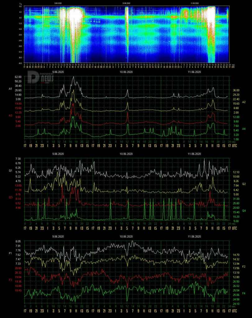
Editor’s Note: Once again, we see a daily discharge of intense Schumann Resonance energies from midnight through 7am on 6/11. These energies steadily grew into a very dense, mid-amplitude “white-out” signature.
Thanks for staying aware of how these energies inform us of how the daily cosmic energies are both arriving on our Planet and literally changing us, and our world for the better, allowing us ALL to BE in…
Schumann Resonance Today. We will try to keep you updated about the variations of the Resonance with this page. The great variations that nobody can explain but that give us a clear sign that the planet is changing. The Earth is vibration higher and higher, just like us!
The Chart time is based on Tomsk – Russia – UTC (Universal Time Coordinated) +7 –Source
SR Base Frequency 7.83 Hz. – Schumann Resonance Today’s Peaks
32
Amplitude
7.30
Quality
7.85
Frequency Max
7.38
Frequency Min
21
Ampltude A2
12
Ampltude A3
9
Ampltude A4
“Every second, a multitude of pulses travel around the world in this unique, resonant chamber between Earth and the ionosphere, sending colluding signals to all microorganisms. These signals couple us to the Earth’s magnetic field. Named after their discoverer, these Schumann Resonances (SR) drive the harmonizing pulse for life in our world.” Eric Thompson
6/11 17:00 – After the previous movements that had the maximum at Power 32, a period of very low activity started very suddenly. The Frequency has continued to oscillate around 7.60 Hz and there have also been fluctuations in the Quality, the Amplitude during this period has remained below Power 10. At the time of this update, the frequency is around 7.50 Hz.
6/11 12:00 – The activity is continuing and so far has been steadily and gradually increasing. The maximum values in the last hours were Power 28 at 10 UTC and Power 32 at 11:30 UTC. At the same time, there were also several peaks in Quality while the Frequency continues to remain basically low with the possibility that the activity continues.
6/11 08:00 – From the graphs we can see how the Frequency has remained around 7.60 Hz since yesterday, this has led to a certain ‘instability’ with slight movements of Amplitude and Quality. The highest values were reached by two isolated peaks at 21 and 23 UTC yesterday and were around Power 17. At the time of this update the Frequency remains low while the Quality is having wide oscillations, the Amplitude is gradually increasing.
6/10 14:00 – Total calm, the Frequency is trending below 7,70 Hz.
6/10 14:00 – All is back to normal, very light activity .
6/10 13:00 – The TSU website is down (host unavailable) so we do not have the usual data from this source. Above the chart from an alternative source while we wait.
6/10 10:00 – The new graphs show that since yesterday afternoon the Frequency began a slow and gradual rise up to exceed the base value and reach and stabilize around 7.90 Hz, this trend was interrupted at 5 UTC when a rapid change in Frequency has also led to movements in the Quality and Amplitude that reached Power 27. After this isolated peak, the Frequency returned to its increasing trend and the other parameters returned to normal.
6/9 17:00 – Today’s activity period lasted for about 9 hours, from 5 to 14 UTC, the most intense phase was around 10 UTC when the maximum value of Power 62 was reached.
6/9 13:00 – Frequency has tended to be low and Amplitude and Quality movements have continued, a new peak at Power 31 occurred at 11:30 UTC while variations continue.
6/9 11:30 – After a first phase that produced the maximum at Power 40 as previously reported, a new ascent of the Amplitude took place from 8 UTC. This within two hours led to the peak of Power 62 at 10 UTC. At the time of this update we are around Power 45.
6/9 07:30 – The complete calm lasted only few hours, about 5 from 16 to 21 UTC yesterday, after which the Quality movements began, giving a light green coloring to the main graph, around 4 UTC the Frequency began to gradually decrease with large and rapid changes and soon the Amplitude has started to follow. From 5 UTC the Amplitude started to increase to Power 25, Power 31 and Power 40 in rapid succession with the last peak occurred just before 7 UTC.
6/8 17:00 – In what we might call the second period of activity, from 12 to 16 UTC, the most intense phase was around 14 with Power 37. The Frequency at the time of this update is leaving the low values around 7.50 Hz rising back.
6/8 14:00 – The low Frequency condition lasted one hour, from 12 to 13 UTC and within that we had the spike at Power 14.
6/8 13:00 – The Frequency dropped to today’s minimum of 7.37 Hz possible start of new spikes.
6/8 12:00 – The first period of activity seems to have gone into a temporary stop at 12 UTC even if the Frequency remains at basically low values and therefore foreshadowing other movements. These movements that we saw lasted about 4 hours, from 8 to 12 UTC and the highest value was Power 45 at 9:30 UTC.
6/8 09:30 – Frequency is slowly decreasing and Amplitude just passed Power 30.
6/8 09:00 – The new graphs show a period of calm that began yesterday at 15 UTC and ended at 6 UTC today when more marked oscillations of the Frequency started. As they became more significant, movements began as well in both Quality and Amplitude which reached Power 10 at the time of this update.
6/7 17:00 – Today’s activity lasted 11 hours, from 3 to 14 UTC, the part with the greatest peaks was between 10 and 11 UTC. For all this time of activity the Frequency has remained in the lower quadrant to rise slightly towards the end of the graph. From 7 to 12 UTC the Amplitude remained constantly above Power 47. The situation is now calm.
6/7 13:00 – As we can see from the graphs, the movements continued and with even higher values, Power 76 was reached at 10:30 UTC in correspondence with a further drop in the Frequency down to 7.31 Hz. The Frequency remains on low levels so other movements are likely.
6/7 10:00 – After the movements previously reported, the maximum values reached by the Amplitude continued to increase; after about an uninterrupted hour above Power 50, at 9 UTC a new high is recorded at Power 69. This simultaneously with wide oscillations of the Frequency.
6/7 08:00 – The strong activity that is currently underway began at 3 UTC when the Frequency started to drop steeply until it reached today’s minimum value of 7.40 Hz shortly after 5 UTC. Amplitude started to rise from 4 UTC with constantly increasing peaks until it reached what is the maximum so far, Power 61 at 7 UTC.
6/6 17:00 – The day shown so far has passed with very light and scattered movements for the most part, the highest value was Power 13 shortly after 6 UTC with other variations around Power 10 at 11 and 14 UTC. A sudden drop in Frequency around 16 UTC was followed shortly thereafter by a flicker of Amplitude, at the time of this update reached today’s maximum of Power 14 at 16:30 UTC.
6/6 08:00 – After a fairly long period of calm, slight movements began at 3 UTC with a drop in the Frequency below 7.60 Hz, this led to Amplitude oscillations that gradually increased until they exceeded Power 10 shortly after 10 UTC, Quality also started to fluctuate in the same period.
6/5 20:30 – Another day of scattered peaks, the first isolated movement was at 23 UTC yesterday evening and reached Power 20, a second peak at 3 UTC reached Power 30, accompanied by a rapid drop in frequency which immediately returned to normal values. The more consistent Frequency oscillations began again just before 6 UTC and, together with Quality movements, led to a series of Amplitude peaks around Power 17; this condition lasted about three hours, until 9 UTC. Since then the movements have lost vigor until they reach calm at 17 UTC.
6/4 20:30 – Today’s movements were isolated and scattered throughout most of the day, the maximum peaks occurred between 6 and 7 UTC and reached Power 28. Another period of activity, which reached Power 17, occurred between 10 and 12 UTC when the Frequency has reached today’s minimum value of 7.40 Hz.
6/3 22:00 – Today’s activity lasted about 8 hours, from 5 to 13 UTC, a period during which the Frequency reached the minimum of 7.27 Hz and corresponded to the maximum Amplitude peak at Power 46 at 17:34 local time, i.e. 12:34 UTC. The situation then calmed down considerably.
6/2 17:00 – The activity previously reported remained limited in three hours, from 6:30 to 9:30 UTC, after the peak at Power 60 at 7 UTC there were other movements that had the maximum around Power 28. The minimum Frequency value occurred at 8:30 UTC with 7.34 Hz after which it returned to rise to stabilize, in the last hours, around 7.70 Hz.
6/2 08:00 – Today the activity started at 6 UTC with the Frequency that began a rapid drop, ongoing at the time of this update, passing 7.50 Hz at 7 UTC, the Amplitude began to rise shortly after the initial Frequency drop, at 6:30 UTC, to reach Power 60 at 7.
6/1 17:00 – Today’s activity can be divided into two parts, the first from 3 to 12 UTC with medium-sized peaks was followed by a break lasting about 4 hours, until 15 UTC when a rapid dip in the Frequency, that reached 7, 42 Hz, pushed the Amplitude up to Power 68, reached at 16:20 UTC. At the time of this update, the frequency is rising around 7.70 Hz.
6/1 10:00 – The new graphs show a period of calm from 16 to 23 UTC, during this period all parameters have remained on normal levels. From midnight UTC the frequency started a slow and constant drop along with wide fluctuations in the Quality, the Amplitude also started to move toward the Power 30 threshold at 4:30 UTC, the Frequency reached the minimum value of 7.25 Hz at 6 UTC in correspondence with the maximum amplitude reached so far at Power 36. After these movements the Frequency remained below 7.50 Hz and variations in both Quality and Amplitude continued, the latter remaining around Power 20.
5/31 17:00 – The day continued with activity that went down in intensity although the variations in Frequency were significant. After the two peaks previously reported, others followed around Power 20, they ended around 13 UTC when the Frequency also started to oscillate much less.
5/31 07:30 – At 22 UTC yesterday, without having a period of true calm in the previous hours, the Frequency had a rapid drop falling below 7.50 Hz, this led to two peaks in the Amplitude that first reached Power 32 at 23 UTC and then Power 30 at 00:30. The Quality has also undergone wide variations over the same period, all these movements have continued and had a new high at 4:30 UTC when Amplitude reached Power 74. Frequency has maintained the downward trend and consequently a new oscillation of the Amplitude reached Power 45 at 6:20 UTC. At the time of this update, movements in both Frequency and Quality continue.
5/30 17:00 – There is a pause in the activity but we cannot say that it is calm, even if there are no Amplitude movements, the Frequency is decreasing.
5/30 14:00 – Even today jagged activity, after the last peak at Power 51 of 19 UTC yesterday, the drop was sudden while the Frequency returned to the base value. The calm condition continued until 2 UTC when the Frequency started to move, from 4 UTC these movements became wider and led to an Amplitude peak to Power 31 at 5 UTC. The Frequency has continued to oscillate while the Amplitude has repeatedly touched Power 15. At the time of this update, the Frequency remains basically low but not on excessive values.
5/29 19:00 – Here is the activity we expected, the Frequency has further decreased below 7.50 Hz and the Amplitude oscillations have increased. Just after 17 UTC a first peak reached Power 34 followed less than an hour later by another strong increase to Power 46 at 18 UTC.
5/29 17:00 – We are still in a condition of low frequency therefore the activity, even if moderate, is continuing. After the peak at Power 63 other movements occurred around Power 30 with wide fluctuations in Quality. At the time of this update the Frequency has further decreased to 7.50 Hz so it is possible that we will see other activity.
5/29 14:30 – As we said earlier, the Frequency on low values can be indicative of further activity and in fact it was. As a continuation of the activity previously reported there were moderate variations in the Quality while the Frequency remained around 7.60 Hz, this led to movements in amplitude which eventually led to a peak at Power 63 at 12:30 UTC. The Frequency continued to remain at 7.60 Hz even after this movement, followed by a smaller one around Power 23 just before 14 UTC.
5/29 09:30 – Even today the new graphs show a slight activity that continues without reaching high values. At 6 UTC there was a dip in the Frequency which reached 7.42 Hz at 8 UTC, the response of the Amplitude, as often happens, was in agreement and at 8 UTC it reached the maximum value of Power 25. At the moment of this update the Frequency still remains basically low, we will see if this will be the signal of other activity.
5/28 17:00 – The slight activity shown in the graphs lasted about 8 hours, the most intense phase was from 7 to 9 UTC when there were large frequency fluctuations. From 13 UTC the situation has normalized even if the Frequency remains basically low.
5/28 12:00 – The calm period shown in the new graphs lasted about 18 hours, until 3 UTC this morning, when the Frequency started to oscillate with a gradual descent towards the minimum value of 7.33 Hz. The Amplitude also started oscillations reaching Power 21 shortly after 4 UTC and again at the same time as the minimum frequency peak at 8 UTC.
5/27 17:00 – Calm.
5/27 10:30 – After yesterday’s powerful activity, there were only 4 hours of calm, from 17 to 21 UTC. The movements that started then were however very light although steadily increasing. The Amplitude began to touch Power 10 from 3:30 UTC culminating with the maximum value so far of Power 23 reached at 7:30 UTC. Frequency remained basically stable slightly below the base value of 7.83 Hz.
5/26 17:00 – The movements seem to have calmed down, the descent towards the minimum values began at 14 UTC when the Frequency also started a jagged ascent; from 16 UTC the situation seems calm.
5/26 15:30 – Today’s activity, apart from the black hole, has so far been very powerful. To us, conspiracy theorists who don’t believe in coincidences, screeches a lot that during the peak phase there was this suspicious darkening where probably a more than significant value was reached; who cares, things do not change much in the end. Probably today the combination of Amplitude, Frequency and Quality would have brought the value of the ECC to touch the 500. The part after the hole, however, saw very wide oscillations that reached and exceeded Power 70 at 11:40 and at 13:15 UTC.
5/26 12:00 – After a temporary interruption of the data source site, the situation has partially returned to normal and what we see is massive activity! The first period of activity started at 2 UTC when the Amplitude started a steep climb which led to the strongest peak of this first phase of Power 67 at 3:30 UTC. This was followed by about 2 hours above Power 50. This first move ended at 5:30 UTC. At 7 UTC a new surge, constant and continuous, brought Amplitude to Power 72 at 8:20 UTC. This phase was interrupted by a BLACKOUT that started at 9 UTC and ended at 11:30 UTC, too bad, there were probably other very significant peaks … I don’t think we’ll ever know. At the moment of this update the Amplitude is still rising around Power 70.
5/26 09:00 – The TSU website is down, cannot be reached. While we wait to the site to return online we are going to use this temporary chart, it shows light activity that started little before 6 am UTC.
5/25 17:00 – Today has been a day in which there were no Amplitude movements that exceeded Power 11, this maximum was touched around midnight UTC, at 4 and at 13:30 UTC the Amplitude approached Power 10. The frequency, since few hours, is steadily and gradually decreasing, at the time of this update it is around 7.55 Hz and an isolated Amplitude movement is being generated that has reached Power 17.
5/24 17:00 – After the activity previously reported, the peak at Power 47 at 7 UTC followed by a minor movement that reached Power 24 at 8:30 UTC, the situation returned calm. This until 15 UTC when the Frequency has started to decrease until it reached 7.41 Hz at 16:30 UTC. This decrease can be seen in the main graph with the most intense coloring in the last hour. We will see if this decrease will lead to Amplitude’s movements or will be temporary.
5/24 08:00 – After about 18 hours of total calm, at 6:30 UTC today, suddenly, the frequency had a drop from 8.03 Hz to 7.47 in 40 minutes, this gave way to a strong variation of amplitude that at 7:30 UTC reached Power 47; we could paraphrase this event as a person who is trotting at short (Amplitude) and frequent (Frequency) steps who suddenly changes pace to a reduced frequency but with large strides (Amplitude).
5/23 17:00 – Even today we can say that it was not a real calm day, there were some short-lived isolated peaks, Power 17 shortly before 7 UTC and Power 12, lasting about an hour, from 10 to 11 UTC. Some wide fluctuations in Quality, without reaching high values, colored the main graph between 2 and 4 UTC. Frequency remained much of the time around the base value with a slight drop towards the end of the graph.
5/22 17:00 – An isolated peak, lasted about an hour, occurred from 15 to 16 UTC reaching a maximum value of Power 32 and coincided with a decrease in Frequency down to 7.54 Hz. It returned immediately afterwards towards values normal. Today, however, there has never been a real calm, various parameters have oscillated, the one that has had the most movements is the Frequency.
5/22 14:00 – Not much to report today, mainly there was no calm but not even significant activity, slight Amplitude fluctuations with a maximum at Power 10 at 7 UTC, calm in Quality apart from the first hours of the day and Frequency that oscillates around the base value.
5/21 20:00 – The scale of the Amplitude graph has changed and we clearly see that the maximum peak today was Power 50; the activity is continuing with more marked fluctuations also in Quality, the Amplitude has reached Power 21 at 19 UTC while the Frequency is in a phase of constant and gradual decline that has started many hours back, from the past midnight UTC, it has now reached the minimum value recorded today of 7.44 Hz.
5/21 17:00 – A more intense phase of activity began just before 16 UTC and in a few minutes brought the amplitude to today’s maximum peak of Power 51. With the new graphs we will be able to see more exactly how much it has reached given the very small scale of these of today. The frequency continues to remain low around 7.50 Hz.
5/21 15:50 – Moderate activity began at 13 UTC when the Frequency embarked on a slow descent to return, as previously, to 7.50 Hz. This set in motion the Amplitude that has risen above Power 20 from 13:30. UTC with a first Power 28 which was followed by another at 2. At the time of this update, the Frequency started a rapid rise with a consequent decrease in Amplitude.
5/21 09:30 – The new graphs show a situation of slight movements, in the Amplitude graph they are of little entity due to the very large scale, the two movements that are noticed have reached Power 15 at 4 UTC and Power 12 at 8 UTC. The Frequency oscillates around 7.70 Hz moving downward at the time of this update.
5/20 17:00 – The situation has calmed down considerably but the Frequency remains low, around 7.50 Hz.
5/20 13:00 – The first period of activity today lasted about 2 hours, from 4 to 6 UTC and the maximum value of Amplitude was Power 42; the second period also lasted about two hours, from 9:30 to 12 UTC and the maximum value was similar, Power 43. The difference between these two periods of movement is however remarkable in terms of graphic representation as also the other measurements of the Amplitude parameter have undergone strong increases, which have not happened previously, and therefore we see intense colors of yellow, red and green. At the time of this update, the situation seems to be moving towards calm.
5/20 08:30 – After the strong period of activity there was no calm, the amplitude did not undergo great variations but the Quality and even more the Frequency continued to oscillate without interruption. The Frequency at 4 UTC began a rapid drop towards 7.30 Hz, a value on which it remained for about 2 hours and which triggered a peak in Amplitude which reached Power 42 shortly before 5 UTC. The strong oscillations of Frequency are ongoing at the time of this update.
5/19 17:00 – The period of strong activity lasted about 12 hours, from 2 to 14 UTC when the frequency began to gradually rise towards the base levels but not yet reached at the time of this update.
5/19 14:00 – As we expected, given the frequency so low, just before 13 UTC there was a new powerful peak at Power 77 accompanied by the Quality on the rise. Frequency continues to remain at minimum values.
5/19 12:30 – The activity is gradually decreasing, at the time of this update we are around Power 30 but the Frequency remains always low around 7.30 Hz. As often happens the changes in Amplitude can be considered finished when the Frequency returns close to the base value , which hasn’t happened yet. Since the beginning of today’s activity, we have remained above Power 60 for 6 consecutive hours and during this period, from 6 to 7 UTC, the minimum has been Power 90. The Energy of Consciousness Current, for the statistics, reached 190; also on a statistical level on 27 February 2020 the Amplitude reached Power 170 and ECC 378 (due to the fact of a massive increase in the Frequency up to 8.79 Hz).
5/19 07:30 – Just before 7 UTC a new very strong peak was reached Power 110, the movements do not seem to decrease for now, the Frequency remains at minimum levels with very few oscillations.
5/19 06:30 – Very strong activity in progress, from 1 UTC the frequency started a dive that at 3 UTC brought it around 7.23 Hz, when it reached this minimum value, at 2:50 UTC, there was a strong fluctuation in Quality and Amplitude began to rise very quickly to reach two almost identical maximum values of Power 95 at 4 and 5 UTC. From 3:30 UTC we are constantly above Power 70 and at the time of this update we have surpassed Power 100 reaching 103.
5/18 17:00 – After the previous peaks the situation has calmed down considerably even if the Frequency has tended to be low with wide variations, we will see if this will be the reason for further movements or not.
5/18 13:00 – Even today the activity began shortly after 8 UTC when the Frequency started to decrease with a sharp drop to 7.23 Hz, today’s minimum; during this descent both Amplitude and Quality increased, the latter reaching 11.30 at 11 UTC. As for the Amplitude, the first movement reached the maximum value so far of Power 40 at 10 UTC, followed approximately one hour later by Power 36 and Power 23 at 12:30 UTC when the Frequency started a slight rise. At the time of this update the Frequency returned to minimum values so we might see more activity.
5/17 17:00 – Today’s activity, with a nice and flowing teardrop shape, lasted 5 hours, from 9 to 14 UTC; in the central and more intense part, from 10:30 to 12:30, the Amplitude remained constantly above Power 30 with the Frequency below 7.55 Hz. From 14 UTC with a rapid drop in Amplitude and a gradual increase in Frequency, but not towards the base value of 7.83 Hz but around 7.70 Hz, the activity has decreased considerably.
5/17 12:30 – After a period of calm that lasted about 18 hours at 7 UTC today, a marked decrease in the frequency began and gave the go to slight fluctuations in both Amplitude and Quality. These variations have taken on a much more marked characteristic from 9 UTC when the Frequency has approached the value of 7.40 Hz, since then it has been oscillations no more, the Amplitude has started a rapid increase exceeding Power 30 slightly after 10 UTC, Power 40 at 11:30 and Power 60 shortly before 12 when the Frequency has reached the minimum value of 7.40 Hz so far. This coincided with the peak of Power 69 reached at 11:40 UTC. If you have a cat you can observe his behavior in these moments.
5/16 17:00 – Another lively situation, after the peaks previously reported there was a further movement at 8 UTC that reached Power 46, after this the Frequency increased rapidly towards normal values and this marked the end of intense movements, there were only fluctuations left, mainly of Quality and Frequency around normal values.
5/16 07:30 – Even today we can say that the activity was almost continuous, the period with the least movements was from 21 to 23 UTC yesterday and from midnight the Frequency began to decrease and fluctuations in Amplitude began again. The Frequency stabilized between 7.30 and 7.40 Hz from 4 UTC and at the same time the Amplitude had its first surge at Power 39. A further drop in the Frequency to 7.38 Hz at 5:30 UTC gave the start at the second peak of Amplitude at Power 42 shortly after 6 with a further increase at Power 45 occurred at 7. At the time of this update the Frequency still remains low so it is likely that we will see other activity.
5/15 17:00 – Finally, the frequency returned to rise toward normal values and the activity seems to have ended, from 1 UTC until 16 there were 15 hours of ups and downs with the most intense part from 13 to 15:30 UTC, even if this period was not the one where the highest peak was recorded.
5/15 14:30 – Today seems to be a day of strong activity, after the peak at Power 78 there is only a slight drop in Amplitude but the profound fluctuations in Quality and Frequency continued which continued to decrease to today’s minimum of 7, 30 Hz; all this hinted that we would see other major changes in Amplitude soon. And so it was with Power 65 at 13:50 UTC. The Frequency is still at the minimum so we could see more movements.
5/15 11:30 – Yet another increase, Power 78 was achieved just before 11 UTC while the wide fluctuations in Frequency and Quality continue.
5/15 10:30 – With the Frequency remaining between 7.40 and 7.50 Hz, activity is continuing with wide fluctuations in Quality and Amplitude movements, a new peak at Power 42 occurred at 9:30 UTC and the movements continue. The Black Star is influencing Terra/Gaia.
5/15 09:00 – Even today the calm did not last long, the new charts show a peak at Power 35 at 17:30 UTC yesterday which was followed by a break of about 7 hours until 1 UTC today when a rapid drop in Frequency and a Amplitude leap that reached Power 72 at 2:30 UTC. Since then, the variations have continued even if of a lesser extent mainly linked to the wide fluctuations in Frequency and Quality. At the time of this update, the frequency is below 7.40 Hz.
5/14 17:00 – There was very little calm after the strong peak at Power 65 at 9 UTC this morning, the Frequency remained low for most of the time with a slight rise around 13 UTC but to immediately return to drop below 7.40 Hz, where it is swinging even at the time of this update. From 14:30 UTC started also slight movements of the Amplitude which reached Power 20 at 15:30.
5/14 10:00 – The increase that we expected happened, both in Amplitude, which reached Power 65 at 9:20 UTC, and in Quality which saw a further increase. The Frequency continues to remain very low, at 7.25 Hz and it is therefore likely that we will see further activity.
5/14 08:00 – The new graphs show an “unstable” situation, the Amplitude has remained at minimum values for most of the time after yesterday’s peak but the Quality has continued to fluctuate. The Frequency throughout this period has remained below the base value of 7.83 Hz and has started to decrease from 3 UTC, at the same time we also see the increase in the value of Quality and some slight movements in the Amplitude graph. From 6:30 UTC the activity took off with a first peak of Amplitude which reached Power 42 together with a maximum of Quality and the Frequency that fell below 7.30 Hz. Now we are at Power 45 and apparently rising.
5/13 17:00 – The four hours of activity of the UTC morning was the only movement of today’s graphs, Power 80 was however a very strong value and although short-lived, for about 20 minutes the Amplitude remained above Power 50. Note that the frequency, after these movements, did not return around the base value but has stabilized between 7.50 and 7.70 Hz while the quality has continued to oscillate, hence the coloring of the last part of the main graph.
5/13 11:00 – The maximum peak of this phase was at Power 80 reached at 10 UTC during a phase in which the Frequency started to rise again. This first phase of activity lasted 4 hours, from 7 to 11 UTC.
5/13 09:30 – The activity is continuing and the new amplitude maximum just reached has exceeded 40 reaching Power 43, the frequency continues to remain very low. On a statistical level we would like to show the graph that we used yesterday which today shows quite significant data, this to highlight that even if the data we normally use are collected in Russia the variations are on a planetary level.
5/13 09:00 – We finally found out that the problem was probably on the source website that was not updating the images, now the situation has returned to normal. The graphs show for May 12 a period of activity of about 8 hours, from 5 to 13 UTC, within which the remarkable peak of Power 52 was reached at 9, this corresponded to a peak in Quality and a minimum in Frequency. From 13 UTC an almost calm condition returned and lasted until today at 6 UTC when a series of rapid variations brought the Amplitude repeatedly above Power 30 with the maximum at Power 39 at 8:30 UTC. Also, for this activity there is a marked increase in Quality and a sudden drop in Frequency which has reached the minimum of the last few days at 7.27 Hz.
5/12 17:00 – It is difficult to make updates based on the data shown by these graphs, what can be said is that there are no relevant movements, we could say that the situation is calm. There are isolated peaks but these, due to the position of the detectors, are due to external factors and not proper to the Schumann Resonance. To return to normal data reports we will have to wait for the usual graphs to be updated. However, we will update the current chart which has temporarily replaced the usual one even if the cadence is much wider.
5/12 08:30 – The situation has not changed, the data is still missing and the graph is not updated, which is unusual, generally even if the data is not recorded the graph is updated, at least on the date. This time it’s not and it suggests that there are more serious problems … What we see above is, instead, an alternative data source located in Italy. The graph shows the electric field from 1 to 100 Hz, we prefer not to go into excessive explanations as higher technical knowledge is needed and we would create more questions than anything else, what is clear is that it does not seem we’re having much activity in progress in the last hours. The upper part of the image is today, the lower part is from the last days.
5/11 20:30 – Images are not being updated, we’re still stuck at the same from this morning UTC. One of the recent longest blackout was in October 2019 when it lasted more than 2 days, in 2020 there have been few, lasting generally less than a day.
5/11 17:00 – Blackout continues.
5/11 14:30 – Still in dark mode…
5/11 12:30 – The new graphs still show a calm condition even if in the last hours of the data received there have been some ripples in the Amplitude that has repeatedly reached Power 10, from 23 to 3 UTC. And at that the data transmission stopped, so it’s about 10 hours of blackout. It is also noted that from around midnight UTC the Frequency has constantly risen to high values. We will see when the data transmission will resume what the situation will be.
5/10 17:00 – The calm lasted for the whole extension of today’s graph, the only movement, excluding the previous one to Power 8 actually not very relevant, was at 14 UTC with Power 17. Nothing else to report for Quality and Frequency that remained on normal values.
5/10 08:00 – These are the images of a situation of calm, Amplitude and Quality at minimum and Frequency on the base value, we are approaching the 12 consecutive hours of flat calm.
5/09 17: 00 – Today’s moderate activity lasted about 10 hours, from 3 to 13 UTC. After the peak at Power 34 at 8 UTC another followed at 9:30 and reached Power 25 after which a slow descent began with movements around 15, normal values were reached at 13 UTC. The only parameter that has not yet returned to the base value is the Frequency which continues to tend to remain around 7.60 Hz.
5/09 08:30 – After almost two days of total calm, the activity returned to show itself at 4 UTC today with a first isolated peak that reached Power 19. This first movement was anticipated by a series of fluctuations in Quality and a gradual drop in Frequency started around 1 UTC. As these two parameters deviated from the normal values, the Amplitude also reacted and from 6 UTC it began a rapid increase that reached the maximum of Power 34 at 8 UTC.
5/08 17:00 – Total calm, all the values are back to normal.
5/08 14:00 – The almost total calm is continuing, very slight variations in Quality have given the main graph a green color from 6 UTC. The Frequency has dropped slightly to around 7.60 Hz from 9 UTC while the Amplitude has remained at minimum values.
5/08 07:00 – After several days of strong activity, in the graph of the last 3 days we can see a genera calm, apart from the 2 hours of strong activity yesterday. Today we see Power 10 at 1 UTC in a minimal movement with all the parameters on normal values.
5/07 17:00 – The peaks previously reported were followed by a period of 4 hours of calm until 8 UTC when the Frequency gradually began to decrease, this movement lasted until 14 UTC and was accompanied by a slight increase in both Quality and Amplitude, the latter reached the maximum value of Power 15 at 11. Now we are back to calm.
5/07 07:00 – Today the calm did not last long, shortly after midnight UTC a strong variation brought Amplitude to Power 50, for about 40 minutes it maintained this level reaching Power 53 just before 2 UTC when there was a new movement that generated the strongest peak so far of Power 66 at 2. Just reached this maximum there was a rapid descent that at 3 brought the Amplitude back to normal values. The Quality has always remained on normal values while the Frequency has followed the events starting the decrease at the same time as the Amplitude reaching the minimum of 7.38 at 2 UTC and then starting the ascent. At the time of this update, the Frequency has dropped back to around 7.50 Hz and there are very slight movements in the other parameters are noted.
5/06 17:00 – The calm that began yesterday at 13 UTC lasted until 14 UTC today when a momentary isolated peak reached Power 30, little movement even for the other parameters, Quality and Frequency. The duration of this movement was approximately 1 hour after which it has been calm.
5/05 17:00 – After the previously reported peak there was a sudden rise of the Frequency which in 2 hours, from 11 to 13 UTC, returned to normal values, in parallel both the Amplitude and the Quality also fell towards calm. From 14 we are in a calm condition.
5/05 13:00 – Today the activity began calmly, from 7 UTC there is a gradual drop in frequency which reached the minimum value of 7.28 hz at 11, at the same time when there was a peak in Quality at 8.70. The increase in the amplitude of the cycles has increased in parallel with the decrease in the Frequency and has also reached the maximum value so far of Power 45 at 11 UTC. This was followed by a slight drop but since the Frequency remains low it is likely that we will see other movements.
5/04 21:30 – We are now in a gradual descent, it is interesting to summarize the peaks reached during this phase (UTC times):
11 – Power 91
12 – Power 70
14 – Power 61
15 – Power 61
17 – Power 50
18 – Power 37
21 – Power 20
5/04 17:00 – From the beginning of today’s movements at 7 UTC, 10 hours ago, there has been no interruption, there have been two particularly intense periods, from 10 to 12 UTC when we have been constantly above Power 60, and from 14 to 16 UTC when the Amplitude has always remained above Power 50. Apart from a short period of time of about 30-40 minutes around 13 UTC, from 8 to 16, then 8 hours, we have been constantly above Power 37, quite impressive, do we understand the message from Terra/Gaia?
5/04 14:30 – The activity of the best days distinguishes today, after the very strong peak at Power 91, there has been a short break of about 45 minutes at Power 32 before the new increase in progress that is reaching Power 70 at the time of this update. While the Quality remains at minimum levels (and therefore the ECC is not at stratospheric values), the Frequency remains below the base value.
5/04 12:00 – The series of peaks in constant increase continues, after the 77 previously reported others followed in rapid succession exceeding 80 until reaching Power 91 shortly after 11 UTC. The graphs show strong fluctuations in Quality and Frequency as well.
5/04 10:30 – The script is repeating itself, 15 hours of total calm, from 15 UTC yesterday until 6 UTC today when abrupt changes in Quality and Frequency started which were followed by Amplitude movements that reached a first peak at 8 UTC up to Power 50. The Frequency continued to decrease to 7.32 Hz and this minimum further increased the maximum amplitude value bringing it to Power 77 at 10 UTC.
5/03 17:00 – Today’s activity lasted 11 hours, from 3 to 14 UTC when a last peak at Power 49 seems to have closed a strong sequence that has always been increasing. May seems to be a crucial month, we shall see if the Schumann Resonance will ‘resonate’ appropriately. The situation at the time of this update seems to have returned to calm even if the Frequency is not yet back at the base value, it is still quite low, so other slight movements may occur.
5/03 12:00 – Today so far it has been a continuous crescendo, after the last update we had a peak at Power 65 at 9 UTC, one at Power 72 at 10 and, like a clock, Power 80 at 11 UTC. At 11 o’clock there is a drop in Quality, part of the wide oscillations, and the Frequency which always remains at fairly low levels.
5/03 08:00 – Another increase, after the previous peak, a rapid and short drop before going back to Power 63 at 9 UTC. As before Quality in ever wider oscillations and low Frequency.
5/03 08:00 – As anticipated, the activity is continuing, it started at 3 UTC and with a slow and constant increase it reached the maximum value so far of Power 43 at 7:30 UTC. The oscillations of the Quality increased in intensity without however reaching high values while the frequency continued to decrease until it reached 7.32 Hz.
5/03 06:30 – Once again a period of calm, lasting about 15 hours, from 12 UTC yesterday to 3 this morning. All values measured during this period remained stable at basic levels. From 3 UTC there is a gradual increase in Amplitude which at the time of this update reached Power 20, this movement is accompanied by an equally increase in Quality and a less gradual decrease in Frequency which is going below 7.40 Hz. There is the feeling that the activity can continue to increase.
5/02 17:00 – Calm.
5/02 13:00 – We hope you like the constantly updated charts! Today’s situation, after the final part of the activity previously reported yesterday, shows a period of almost calm that started at 22 UTC yesterday and that lasted for about 10 hours until 8 UTC today. During this period, the Amplitude and the Frequency remained on normal values while the Quality had a variation between 3 and 4 UTC. The first isolated peak of Amplitude at 8 UTC reached Power 20, the second, still isolated, reached Power 18 at 8 UTC and the last, isolated as well, reached Power 41 at 11:40 UTC. While these peaks occurred, the Frequency, as it almost always happens, has had wide oscillations towards lower values, but not too low.
5/01 23:00 – Today we worked hard to make the way that the main chart is updated independently of these textual updates, the work is not yet finished but I think it was worth it already! As for the situation, we see that from 15 to 19 UTC the activity was powerful with 3 major peaks at Power 58, 47 and 30. A further isolated peak reached Power 34 at 21:30 UTC. There have also been wide fluctuations in Quality, indicating that the “message” has not always been the same while the Frequency has had a sharp drop between 17 and 19 UTC.
5/01 17:00 – Even today, little or no calm, after the movements described previously we had an isolated peak that reached Power 44 shortly before 12 UTC. In the following 3 hours there were fluctuations in Quality and Frequency but the Amplitude remained at normal values. From 15, however, a rapid drop in Frequency began and once again an increase in Amplitude which in one hour, at 16 UTC, reached today’s maximum at Power 58. Frequency is still very low at the time of this update so it is possible that the activity continues.
5/01 08:30 – There was the impression that the activity would have continued and it did. Resuming from the last update, where we highlighted the frequency that remained high, it remained so, with the Amplitude on normal values, until 2 UTC when a rapid drop began. At the same time, the Amplitude gradually started to rise to reach the maximum at Power 58 just before 7 UTC. This peak was followed by a new drop towards Power 20 and with an increase in frequency.
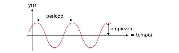
Frequency means how many wave cycle happen in a second, 1 Hz. means 1 cycle per second, 40 Hz. means 40 cycles per second, Amplitude is the size of the vibration, how big is the wave, the chart shows the frequency variation in Hz and the amplitude using the white color.
Note
The Ancient Indian Rishis called 7.83 Hz the frequency of OM. It also happens to be Mother Earth’s natural heartbeat rhythm Schumann resonances are named after professor Schumann who was involved in early German secret space program and was later paper-clipped into the United States. The frequencies of Schumann resonances are fairly stable and are mainly defined by the physical size of the ionospheric cavity. The amplitude of Schumann resonances does change and is bigger when ionospheric plasma gets excited. Ionospheric plasma excitation happens because of solar activity, thunderstorms, use of scalar plasma weapons and HAARP and lately also when the Light forces are clearing the plasma anomaly.
Schumann Resonance Today – Energy of Consciousness Currents
All the SR daily images in one single page See the Images
Explanation of The Chart
The Schumann Resonance Spectrogram Chart
The Schumann Resonance Chart displays data from the magnetic field detector to monitor the resonances occurring in the plasma waves constantly circling the earth in the ionosphere. These three days spectrograms show the activity occurring at the various resonant frequencies from 1 to 40 Hz. Within the spectrogram, the power, or intensity level of each frequency is displayed as a color, with white being the most intense. The Schumann Resonances appear as the horizontal lines at 0.0, 4.0, 8.0, 12.0, 16.0, 20.0, 24.0, 28.0, 32.0, 36.0 & 40.0 Hz. This chart is based on Tomsk, Russia, time UTC +7 (UTC = Universal Time Coordinated).
What is a Spectrogram?
The Spectrogram Calendar is a visual representation of the range of frequencies in the magnetic field at a given location. Similar to how an equalizer displays the frequency content of music played on your stereo, the spectrogram calendar displays the frequency content of a magnetic field. Instead of showing a brief snapshot, it shows changes over a period of time, in this case 3 days.
The local magnetic field is a dynamic field that changes constantly because of variations in the ionosphere and sun and many other influences not yet fully understood. The range of variation displayed in the spectrogram chart is from 0 to 40 cycles per second. The vertical axis is frequency and the horizontal axis is time. The amplitude of a particular frequency at a specific time is represented by the intensity of color (green, yellow, white) of each point in the image.
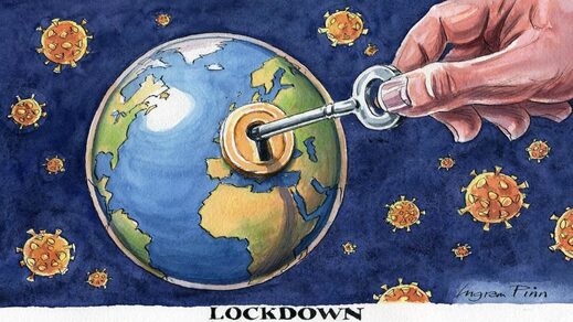
Editor’s Note: Wow! This is truly are l-o-n-g article from IUV, yet it contains so much factual, and scientific (!) information regarding the whole “coronavirus” pandemic which is utterly false and planned to place humanity under uber control. Please read on, share this info freely, and BE in…
For anyone willing to look, there are so many facts that tell the true story, and it goes something like this:
Knowing what we know today about COVID-19’s Infection Fatality Rate, asymmetric impact by age and medical condition, non-transmissibility by asymptomatic people and in outdoor settings, near-zero fatality rate for children, and the basic understanding of viruses through Farr’s law, locking down society was a bone-headed policy decision so devastating to society that historians may judge it as the all-time worst decision ever made. Worse, as these clear facts have become available, many policy-makers haven’t shifted their positions, despite the fact that every hour under any stage of lockdown has a domino-effect of devastation to society. Meanwhile, the media — with a few notable exceptions — is oddly silent on all the good news. Luckily, an unexpected group of heroes across the political landscape — many of them doctors and scientists — have emerged to tell the truth, despite facing extreme criticism and censorship from an angry mob desperate to continue fighting an imaginary war.
My goal is to engage in known facts. You, the reader, can decide if all of these facts, when you put them together, equate to the story above.
Fact #1: The Infection Fatality Rate for COVID-19 is somewhere between 0.07-0.20%, in line with seasonal flu
The Infection fatality Rate math of ANY new virus ALWAYS declines over time as more data becomes available, as any virologist could tell you. In the early days of COVID-19 where we only had data from China, there was a fear that the IFR could be as high as 3.4%, which would indeed be cataclysmic. On April 17th, the first study was published from Stanford researchers that should have ended all lockdowns immediately, as the scientists reported that their research “implies that the infection is much more widespread than indicated by the number of confirmed cases” and pegged the IFR between 0.12-0.2%. The researchers also speculated that the final IFR, as more data emerged, would likely “be lower.” For context, seasonal flu has an IFR of 0.1%. Smallpox? 30%.
As the first study to peg the IFR, the Stanford study came under withering criticism, prompting the lead researcher, Dr. John Ioannidis to note,
“There’s some sort of mob mentality here operating that they just insist that this has to be the end of the world, and it has to be that the sky is falling. It’s attacking studies with data based on speculation and science fiction. But dismissing real data in favor of mathematical speculation is mind-boggling.”
Like all good science, the Stanford data on IFR has now been replicated so many times that our own Centers for Disease Control came out this week to announce that their ‘best estimate’ showed an IFR below 0.3%. In this article on the CDC’s new data, they also highlighted how the cascading declines in IFR has removed all the fears of doomsday:
That “best estimate” scenario also assumes that 35 percent of infections are asymptomatic, meaning the total number of infections is more than 50 percent larger than the number of symptomatic cases. It therefore implies that the IFR is between 0.2 percent and 0.3 percent. By contrast, the projections that the CDC made in March, which predicted that as many as 1.7 million Americans could die from COVID-19 without intervention, assumed an IFR of 0.8 percent. Around the same time, researchers at Imperial College produced a worst-case scenario in which 2.2 million Americans died, based on an IFR of 0.9 percent.
If you’re still unconvinced that the IFR of COVID-19 is roughly in line with a bad flu season, the most comprehensive analysis I have seen comes from Oxford University, who recently stated:
“Taking account of historical experience, trends in the data, increased number of infections in the population at largest, and potential impact of misclassification of deaths gives a presumed estimate for the COVID-19 IFR somewhere between 0.1% and 0.41%.”
Finally, just last week, Stanford’s Dr. Ioannidis published a meta-analysis (because so many IFR studies have been done around the world in April and early May) where he analyzed TWELVE separate IFR studies and his conclusion is so good, I’ll just leave you with it:
The infection fatality rate (IFR), the probability of dying for a person who is infected, is one of the most critical and most contested features of the coronavirus disease 2019 (COVID-19) pandemic. The expected total mortality burden of COVID-19 is directly related to the IFR. Moreover, justification for various non-pharmacological public health interventions depends crucially on the IFR. Some aggressive interventions that potentially induce also more pronounced collateral harms1 may be considered appropriate, if IFR is high. Conversely, the same measures may fall short of acceptable risk-benefit thresholds, if the IFR is low…Interestingly, despite their differences in design, execution, and analysis, most studies provide IFR point estimates that are within a relatively narrow range. Seven of the 12 inferred IFRs are in the range 0.07 to 0.20 (corrected IFR of 0.06 to 0.16) which are similar to IFR values of seasonal influenza. Three values are modestly higher (corrected IFR of 0.25-0.40 in Gangelt, Geneva, and Wuhan) and two are modestly lower than this range (corrected IFR of 0.02-0.03 in Kobe and Oise).
The recent Stanford University antibody study now estimates that the fatality rate if infected is likely 0.1 to 0.2 percent, a risk far lower than previous World Health Organization estimates that were 20 to 30 times higher and that motivated isolation policies…Let’s stop underemphasizing empirical evidence while instead doubling down on hypothetical models. Facts matter.
Facts do matter, but no one listened. Dr. Atlas’ article also helps frame Fact #2.
Fact #2: The risk of dying from COVID-19 is much higher than the average IFR for older people and those with co-morbidities, and much lower than the average IFR for younger healthy people, and nearing zero for children
In January 2020, Los Angeles had an influenza outbreak that was killing children, the LA Times noted that “an unlikely strain of influenza has sickened and killed an unusually high number of young people in California this flu season.” COVID-19 is the opposite of that. Stanford’s Dr. Ioannidis said, “Compared to almost any other cause of disease that I can think of, it’s really sparing young people.”
Italy reported three days ago that 96% of Italians who died from COVID-19 had “other illnesses” and were, on average, 80 years old. From Bloomberg:
“The latest numbers show that new cases and fatalities have a common profile: mostly elderly people with previous illnesses,” ISS chief Silvio Brusaferro said at a news conference Friday.
The best age stratification data I have seen comes from Worldometers.info. Here’s their chart estimating death rate by age group. Please note that death rate is MUCH higher than IFR because death rate uses confirmed COVID-19 cases as the denominator, but it shows you how different the fatality rates are by age:
While this data is “crude”, it’s safe to extrapolate that an 80+ year-old person has a serious risk of dying from COVID-19 while a child faces almost no risk. This fact should drive policy, as Dr. Atlas explains:
Of all fatal cases in New York state, two-thirds were in patients over 70 years of age; more than 95 percent were over 50 years of age; and about 90 percent of all fatal cases had an underlying illness. Of 6,570 confirmed COVID-19 deaths fully investigated for underlying conditions to date, 6,520, or 99.2 percent, had an underlying illness. If you do not already have an underlying chronic condition, your chances of dying are small, regardless of age. And young adults and children in normal health have almost no risk of any serious illness from COVID-19.
Protecting those at most risk of dying from covid-19 while relaxing the strictures on others provides a way forward in the SARS-CoV-2 epidemic, given the virus is unlikely to disappear in the foreseeable future. Such targeted approaches would, however, require a shift away from the notion that we are all seriously threatened by the disease, which has led to levels of personal fear being strikingly mismatched to objective risk of death. Instead, the aim should be to communicate realistic levels of risk as they apply to different groups, not to reassure or frighten but to allow informed personal decisions in a setting of necessary uncertainty.
As one simple example: closing schools makes almost no sense given what we know about COVID-19, while protecting teachers over the age of 60 — to pick a somewhat defensible age boundary — may well make sense. This is why so many countries who seem to respect data more than we do here in the U.S. have already re-opened their schools. In fact, Denmark’s schools have been open since mid-April!! And, for those keeping score, Reuters just reported yesterday that, “Reopening schools in Denmark did not worsen outbreak, data shows.” Here’s a quote:
“You cannot see any negative effects from the reopening of schools,” Peter Andersen, doctor of infectious disease epidemiology and prevention at the Danish Serum Institute said on Thursday told Reuters. In Finland, a top official announced similar findings on Wednesday, saying nothing so far suggested the coronavirus had spread faster since schools reopened in mid-May.
There is little about coronavirus we can be absolutely sure of – this is a brand new disease and our knowledge grows by the day – but most of the available evidence so far strongly suggests that children are neither suffering from coronavirus nor spreading it. Studies in South Korea, Iceland, Italy, Japan, France, China, the Netherlands and Australia all concur that youngsters are “not implicated significantly in transmitting Covid”, not even to parents and siblings.
Adult paranoia, stoked by over-the-top government messaging, union intransigence and media conniptions, is now being inflicted on the youngest members of our society to whom the virus poses a threat so tiny scientists call it “statistically irrelevant”. Instead of nursery rhymes, mixed infants may soon be invited to sing something called the “two-metre-song” as they stick their arms out to keep their friends at bay.
These findings suggest that schools are not a high risk setting for transmission of COVID-19 between pupils or between staff and pupils. Given the burden of closure outlined by Bayhem [4] and Van Lanker [5], reopening of schools should be considered as an early rather than a late measure in the lifting of restriction.
Finally, Dr. Scott Atlas took on the topic of schools in this recent interview:
“”There’s no science whatsoever to keep K-through-12 schools closed, nor to have masks or social distancing on children, nor to keep summer programs closed. What we know now is that the risk of death and the risk of even a serious illness is nearly zero in people under 18.”
Quick update: after I wrote this, the Wall Street Journal published this article titled Is It Safe to Reopen Schools? These Countries Say Yes. To me, this reads as a bit of a litmus test for countries that have independent and data-driven public health officials, and I give the U.S. an ‘F” for our current approach:
But Denmark, Austria, Norway, Finland, Singapore, Australia, New Zealand and most other countries that have reopened classrooms haven’t had outbreaks in schools or day-care centers…In Denmark, the opening of schools had no impact on the progress of the epidemic, said Tyra Grove Krause, a senior official with the State Serum Institute, the country’s disease control agency…Since Austria reopened on May 18, no increase in infections has been observed in schools and kindergartens, a spokesman for the government said…In Norway, the government won’t close schools again even if the number of cases starts rising in the country because there have been no negative consequences from reopening schools on April 20, said Education Minister Guri Melby.
How many more countries need to re-open before the U.S. follows? Seriously, it’s a little embarrassing to be American…IMO we look like total chumps.
Update #2: Dr. Scott Atlas doubled-down on June 1st with this great Op-Ed, once again in The Hill, titled Science says: ‘Open the schools’. As usual, he’s amazingly eloquent, here’s an excerpt but well worth the time to read every word, he simply slays it:
All of this borders on the absurd, when we now know that social distancing and face coverings for children are completely unnecessary.
Never have schools subjected children to such an unhealthy, uncomfortable and anti-educational environment, so science cannot precisely define the total harm it will cause. But science does tell us that risks from COVID-19 are too minimal to sacrifice the educational, social, emotional and physical well-being – to say nothing of the very health – of our young people.
(Special note: there’s a new boogeyman, Kawasaki disease, that some are trying to link to COVID-19. Here’s a great article about that, or see the website of the UK’s Kawasaki Disease Foundation where they discuss the “mishandling of information” about Kawasaki disease. Dr. Atlas’ most recent post discusses this, too: “What about the new threat similar to Kawasaki disease, recently sensationalized as a COVID-19 association? In fact, the association is extremely low, and the incidence of the disorder is itself rare, affecting only 3,000 to 5,000 children in the United States each year. Importantly, the syndrome is typically treatable and never has been regarded previously as a risk so serious that schools must be shuttered.”)
Fact #3: People infected with COVID-19 who are asymptomatic (which is most people) do NOT spread COVID-19
Guangdong Provincial People’s Hospital
On January 13, 2020, a 22-year old female with a history of congenital heart disease went to the emergency room of Guangdong Provincial People’s Hospital complaining of a variety of symptoms common to people with her condition, including pulmonary hypertension and shortness of breath due to atrial septal defect (hole in the heart). Little did she know her case would set off a cascade of events resulting in a recently published paper that should have ended all lockdowns around the world simultaneously. Three days into her hospital stay, her condition was improving. Routine tests were run, and to the clinicians alarm and surprise, she tested positive for COVID-19. As the physicians noted, “the patient had never fever, sore throat, myalgia or other symptoms associated with virus infection.” Said differently, she was completely asymptomatic for COVID-19.
It’s not that easy to find people who are infected with COVID-19 but asymptomatic, because they don’t seek medical attention. Here in Oregon where I live, you can’t even get a COVID-19 test unless you have symptoms. So, the stars aligned to put this woman in a hospital with researchers studying COVID-19, and she became the subject of an extensive contact study published on May 13 in Respiratory Medicine, titled, “A study on infectivity of asymptomatic SARS-CoV-2 carriers.”
The researchers wanted to find out whether this woman, with a COVID-19 infection but no symptoms, had infected anyone else, so they chose to look at every single contact they could identify within the previous 5 days prior to her positive test. So, how many people did they have to screen? 455. Not a small number, as the researchers explain:
455 contacts who were exposed to the asymptomatic COVID-19 virus carrier became the subjects of our research. They were divided into three groups: 35 patients, 196 family members and 224 hospital staffs. We extracted their epidemiological information, clinical records, auxiliary examination results and therapeutic schedules.
As you can see, being hospitalized led to the majority of the contacts this woman had, both with other patients and with many members of the hospital staff. Notably, all of these contacts took place indoors and one might argue many of the contacts — at least with hospital staff — would have involved relatively intimate contact. Amongst the patients, the average age was 62, arguably making them higher risk, and many of those patients were immunocompromised for a variety of reasons, including chemotherapy and cardiovascular disease. So how many of the 455 people were infected by the asymptomatic 22-year old woman?
“In summary, all the 455 contacts were excluded from SARS-CoV-2 infection…”
Said differently, exactly zero people were infected. The scientists, in typically understated fashion, offer up a comment about the question I hope you are asking yourself right now (namely, why are we all on lockdown if asymptomatic people with COVID-19 can’t spread the infection?), stating, “the result of this study may alleviate parts of the public concern about asymptomatic infected people.”
If this study had been published in early March, the odds that the world would have locked down are very, very low. Yet, this study, published only two weeks ago, is nowhere to be found in the media, and is never mentioned by policy makers. It just sits there, sharing the truth for anyone willing to listen.
Fact #4: Emerging science shows no spread of COVID-19 in the community (shopping, restaurants, barbers, etc.)
“There is no significant risk of catching the disease when you go shopping. Severe outbreaks of the infection were always a result of people being closer together over a longer period of time…”
– Professor Hendrick Streek , University of Bonn
We just learned that asymptomatic people infected with COVID-19 are very unlikely to be able to spread the infection to others. Emerging and
Dr. Hendrick Streek
published science shows transmission of COVID-19 in retail establishments is extremely unlikely. Professor Hendrik Streeck from the University of Bonn is leading a study in Germany on the hard-hit region of Heinsberg and his conclusions, from laboratory work already completed, is very clear:
“There is no significant risk of catching the disease when you go shopping. Severe outbreaks of the infection were always a result of people being closer together over a longer period of time.
“When we took samples from door handles, phones or toilets it has not been possible to cultivate the virus in the laboratory on the basis of these swabs….”
Uh oh. You mean closing parks, closing stores, wearing gloves and masks at the grocery store, fumigating our groceries, and just being generally paranoid wasn’t necessary? As Dr. Streeck confirms:
“It is important to obtain this data in order to make sure that decisions are taken based on facts rather than assumptions. The data should serve as a basis of information for the government so they can then think about their further course of action,” he said.
And he continues:
“People could lose their jobs. They might not be able to pay their rent anymore and staying inside for a longer time can lead to weakening of our immune system.”
“The goal is not a complete containment of the virus. We need to know where the actual capacity limits of our hospitals are. How many infections are too many? What do intensive care medics say?”
And, finally:
“It is important to start thinking about a ‘rollback’ strategy and his hope is to “deliver the relevant facts so that people have a good foundation for their decisions.”
Fact #5: Published science shows COVID-19 is NOT spread outdoors
No. Just no.
In a study titled Indoor transmission of SARS-CoV-2 and published on April 2, 2020, scientists studied outbreaks of 3 or more people in 320 separate towns in China over a five-week period beginning in January 2020 trying to determine WHERE outbreaks started: in the home, workplace, outside, etc.? What’d they discover? Almost 80% of outbreaks happened in the home environment. The rest happened in crowded buses and trains. But what about outdoors? The scientists wrote:
“All identified outbreaks of three or more cases occurred in an indoor environment, which confirms that sharing indoor space is a major SARS-CoV-2 infection risk.”
Said differently, there’s really no science to support all the outdoor bans that my home state of Oregon and so many other states have put in place. I’ll leave you with my favorite quote from the study because it’s really quite infuriating to read when you consider some of the ways Governors here in the U.S have behaved (and some still do) by banning all sorts of outdoor activities, arresting paddle boarders on the water, etc.:
“The transmission of respiratory infections such as SARS-CoV-2 from the infected to the susceptible is an indoor phenomenon.”
Quick Update: Apparently the health minister of British Columbia, Canada, got the memo about the lack of airborne risk, this article appeared on June 1:
The article says:
One of B.C.’s top health officials, however, says medical professionals have a pretty clear picture of how the virus is transmitted. “There is absolutely no evidence that this disease is airborne, and we know that if it were airborne, then the measures that we took to control COVID-19 would not have worked,” Dr. Reka Gustafson, B.C.’s deputy provincial health officer, told CTV Morning Live Monday.”We are very confident that the majority of transmission of this virus is through the droplet and contact route….”The overwhelming majority of (COVID-19) transmissions occur through close, prolonged contact and that is not the pattern of transmission we see through airborne diseases,” she said.
I sure hope Major League Baseball, the National Football League, and the NCAA are all paying attention…not to mention all the people in Portland here still riding bikes and running with masks on.
Fact #6: Science shows masks are ineffective to halt the spread of COVID-19, and The WHO recommends they should only be worn by healthy people if treating or living with someone with a COVID-19 infection
Just today, the World Health Organization announced that masks should only be worn by healthy people if they are taking care of someone infected with COVID-19:
“If you do not have any respiratory symptoms such as fever, cough or runny nose, you do not need to wear a mask,” Dr. April Baller, a public health specialist for the WHO, says in a video on the world health body’s website posted in March. “Masks should only be used by health care workers, caretakers or by people who are sick with symptoms of fever and cough.”
“In our systematic review, we identified 10 RCTs that reported estimates of the effectiveness of face masks in reducing laboratory-confirmed influenza virus infections in the community from literature published during 1946-July 27, 2018….In pooled analysis, we found no significant reduction in influenza transmission with the use of face masks…Our systematic review found no significant effect of face masks on transmission of laboratory-confirmed influenza….Proper use of face masks is essential because improper use might increase the risk for transmission.”
English translation: there is no evidence that wearing masks reduces the transmission of respiratory illnesses and, if masks are worn improperly (like when people re-use cloth masks), transmission could actually INCREASE. Moreover, this study was a meta-analysis, which means it dug deep into the archive of science (all the way back to 1946!) to reach its conclusions. Said differently, this is as comprehensive as science gets, and their conclusions were crystal clear: masks for the general population show no evidence of working to either slow the spread of respiratory viruses or protect people.
Sigh
This study is far from the only one to reach this conclusion (which makes the choice of a grocery store chain like my beloved New Seasons to make masks mandatory for all customers really quite unbelievable). The purpose of science is to arbitrate these thorny issues and while the science is clear, the hysteria continues. It turns out, the effectiveness of masks has a long history of debate in the medical community, which explains why so much science has been done on the topic. I will just highlight a few studies before you fall asleep:
My favorite article is actually a review of much of the science and it’s a great place to start for anyone who likes to do their own research. Titled, “Why Face Masks Don’t Work: A Revealing Review“, it was written to challenge the need for dentists to wear face masks, but all the science quoted and conclusions drawn apply to airborne pathogens in any setting. Some of the best quotes:
“The science regarding the aerosol transmission of infectious diseases has, for years, been based on what is now appreciated to be ‘very outmoded research and an overly simplistic interpretation of the data.’ Modern studies are employing sensitive instruments and interpretative techniques to better understand the size and distribution of potentially infectious aerosol particles…The primary reason for mandating the wearing of face masks is to protect dental personnel from airborne pathogens. This review has established that face masks are incapable of providing such a level of protection.”
And my favorite quote:
“It should be concluded from these and similar studies that the filter material of face masks does not retain or filter out viruses or other submicron particles. When this understanding is combined with the poor fit of masks, it is readily appreciated that neither the filter performance nor the facial fit characteristics of face masks qualify them as being devices which protect against respiratory infections. “
“Masks and respirators do not work. There have been extensive randomized controlled trial (RCT) studies, and meta-analysis reviews of RCT studies, which all show that masks and respirators do not work to prevent respiratory influenza-like illnesses, or respiratory illnesses believed to be transmitted by droplets and aerosol particles. Furthermore, the relevant known physics and biology, which I review, are such that masks and respirators should not work. It would be a paradox if masks and respirators worked, given what we know about viral respiratory diseases: The main transmission path is long-residence-time aerosol particles (< 2.5 μm), which are too fine to be blocked, and the minimum-infective-dose is smaller than one aerosol particle.”
To put this in simple terms: in order for a mask to really be effective that covered both your nose and mouth, you would asphyxiate. The minute the mask allows you to breathe, it can no longer filter the micro-particles that make you sick.
Finally, I often see this study from 2015 in the BMJ cited: “A cluster randomised trial of cloth masks compared with medical masks in healthcare workers“, and it bears repeating, since MOST of the masks I see people wearing in the community right now are cloth masks. Not only are these masks 100% ineffective at reducing the spread of COVID-19, but they can actually harm you. As the researchers explain:
“This study is the first RCT of cloth masks, and the results caution against the use of cloth masks. This is an important finding to inform occupational health and safety. Moisture retention, reuse of cloth masks and poor filtration may result in increased risk of infection. Further research is needed to inform the widespread use of cloth masks globally.”
Increased risk of infection? Yes, that’s what it says. Other studies have also looked at the impact masks have on your oxygen levels (because you’re are forced to re-breathe your own Co2) and it’s not good. Scientists looked at oxygen levels of surgeons wearing masks while performing surgery and found: “Our study revealed a decrease in the oxygen saturation of arterial pulsations (SpO2) and a slight increase in pulse rates compared to preoperative values in all surgeon groups.”
Just this past week, this article came out in the New England Journal of Medicine, written my several doctors and public health officials with the title, “Universal Masking in Hospitals in the Covid-19 Era,” and this statement seems a perfect way to end my discussion of masks:
“We know that wearing a mask outside health care facilities offers little, if any, protection from infection. Public health authorities define a significant exposure to Covid-19 as face-to-face contact within 6 feet with a patient with symptomatic Covid-19 that is sustained for at least a few minutes (and some say more than 10 minutes or even 30 minutes). The chance of catching Covid-19 from a passing interaction in a public space is therefore minimal. In many cases, the desire for widespread masking is a reflexive reaction to anxiety over the pandemic.”
Fact #7: There’s no science to support the magic of a six-foot barrier
Iceland has already made the two-meter (6 foot) rule optional, according to this article. The reason for the recommendation to keep 6-feet of distance from your fellow citizens during the pandemic dates back to 1930, explained here by the BBC: Umm…no
Where does the two-metre rule come from? Surprisingly, it can be traced back to research in the 1930s. Back then scientists established that droplets of liquid released by coughs or sneezes will either evaporate quickly in the air or be dragged by gravity down to the ground. And the majority of those droplets, they reckoned, would land within one to two metres. That is why it is said the greatest risks come from having the virus coughed at you from close range or from touching a surface – and then your face – that someone coughed onto. How conclusive is that?
Are you impressed with that science? Me neither. As this wonderful article explains:
A few early studies suggest that contaminated droplets could stay airborne for a few hours and pose a risk. But that research comes with a caveat: “While this research indicates that viral particles can be spread via bioaerosols, the authors stated that finding infectious virus has proven elusive and experiments are ongoing to determine viral activity in collected samples,” wrote Dr. Harvey Fineberg from the National Academies of Science, Engineering, and Medicine earlier this month.
It goes further:
And the commonly held fear that a random passerby will infect a stranger? Here’s more grade-school level talk from the CDC: “COVID-19 is thought to spread mainly through close contact from person-to-person in respiratory droplets from someone who is infected. People who are infected often have symptoms of illness. Some people without symptoms may be able to spread the virus [which science from China has proven is untrue].”
Not only would that sort of conclusion warrant a failing grade in any post-doctoral program, I am pretty sure the average eighth-grade science teacher would take a big red pen to that passage. “Thought.” “Some?” “May?” Keep in mind, there are no links to any scientific studies or papers for the average thinking person to review to decide whether those claims are legitimate.
The CDC also can’t quite make up its mind about the safety of large gatherings in the COVID-era. In mid-March, the agency asked Americans to limit gatherings of 250 people or more. A few weeks later, the White House, at the behest of the CDC, urged Americans to avoid gatherings of more than 10 people. There is no science, however, to support either number. (What is so fateful about 250 people? Why not 175? And why 10 people? Why not 16 or 17?)
The article takes dead aim at so many Governors who are absolutely running with these completely unsupportable recommendations:
Even that fuzzy advice has been bastardized by the petty tyrant lurking inside every big state governor, small-town mayor, and homeowners’ association president. Over the weekend, Michigan Governor Gretchen Whitmer banned people from going to a neighbor’s house. “All public and private gatherings of any size are prohibited,” Whitmer announced. “People can still leave the house for outdoor activities . . . recreational activities are still permitted as long as they’re taking place outside of six feet from anyone else.”…There will be plenty of soul-searching after this crisis abates: demanding to know the scientific rationale for keeping us six feet apart when people needed each other most should be at the top of the list.
“‘I think it will be much harder to get compliance with some of the measures that really do not have an evidence base,’ he said. ‘I mean the two-metre rule was conjured up out of nowhere.’ “
When you digest all of the facts we now know about COVID-19, the simplest policy recommendation actually makes the most sense in my opinion: If you have COVID-19, stay home. If you must go out, wear a mask. Everyone else, wash your hands, and get on with your life. It should have been that easy, but instead we chose to lockdown society, an unprecedented step. Why?
Oh, and this is a real headline. God help us all.
Indeed, why did we lockdown society, and has it worked? I stole the phrase above from an opinion piece in the Wall Street Journal written by Editorial Board member Holman W. Jenkins, Jr., I believe he captured it perfectly:
We started off sensibly. “This is not something [American families] generally need to worry about,” said CDC’s Dr. Nancy Messonnier in mid-January. “It’s a very, very low risk to the United States,” said Dr. Anthony Fauci a week later.Bill de Blasio, mayor of New York, urged residents to go about their business normally as recently as March 11.As coldblooded as it seems, these were the right statements at the time. Under “flatten the curve,” changes in public behavior aren’t needed until they are needed. Roll that around in your mind a bit. The better we do at equipping local hospitals, the less we need to bankrupt local businesses and their workers to slow the virus as it runs its course through society. That was the idea we started with. Not even the U.K. Imperial College study that so alarmed the world’s policy makers recommended indiscriminate lockdowns and shelter-in-place orders. If we meant what we said, we’ve overshot in many places. Beds are empty. A ventilator shortage did not materialize. We failed to set aside enough capacity to treat other medical conditions like strokes and heart attacks. This is costing lives.
What happened? From Bill Gates to your local editorialist, a new priority waddled to the fore. We decided that, whatever contributes to killing Americans at a routine total rate of 8,000 or so a day, it shouldn’t be the coronavirus.
Accidents, yes — 6% of deaths. Heart disease, yes — 23%. Flu and pneumonia, yes — 2%.
These deaths are allowed but not deaths from the coronavirus even at the cost of economic ruin for millions. Of course the media and public are free to decide now they never wanted flatten the curve; they wanted to be spared the virus altogether. But explain how this is to be done. And explain why. The Economist magazine says we can’t restart the economy without an “unprecedented” $180 billion testing regime. Unprecedented is an interesting word because China, a country of 1.4 billion people with eight cities larger than New York, either must have developed such a system with nobody noticing or hasn’t found it necessary.
Why did we lockdown in the first place? Here are the facts.
Fact #8: The idea of locking down an entire society had never been done and has no supportable science, only theoretical modeling
Dr. D.A. Henderson
In fact, the first time the idea was ever raised to lockdown everyone was in 2006, in this paper titled Targeted Social Distancing Designs for Pandemic Influenza. The paper detailed “how social contact network-focused mitigation can be designed” and modeled (more on that in a moment!) various outcomes based on how people behaved. At the time, cooler heads prevailed and criticized the ideas in the paper, notably this critique from Dr. D.A. Henderson, the man who led the public effort to eradicate smallpox. According to the New York Times:
Dr. Henderson was convinced that it made no sense to force schools to close or public gatherings to stop. Teenagers would escape their homes to hang out at the mall. School lunch programs would close, and impoverished children would not have enough to eat. Hospital staffs would have a hard time going to work if their children were at home.
The measures embraced by Drs. Mecher and Hatchett would “result in significant disruption of the social functioning of communities and result in possibly serious economic problems,” Dr. Henderson wrote in his own academic paper responding to their ideas.
The answer, he insisted, was to tough it out: Let the pandemic spread, treat people who get sick and work quickly to develop a vaccine to prevent it from coming back.
Soon after, Dr. Henderson and several other prescient colleagues penned an important paper encapsulating many of these ideas, Disease Mitigation Measures in the Control of Pandemic Influenza, including this astonishing (given what just happened) conclusion:
There are no historical observations or scientific studies that support the confinement by quarantine of groups of possibly infected people for extended periods in order to slow the spread of influenza. A World Health Organization (WHO) Writing Group, after reviewing the literature and considering contemporary international experience, concluded that “forced isolation and quarantine are ineffective and impractical.”2 Despite this recommendation by experts, mandatory large-scale quarantine continues to be considered as an option by some authorities and government officials.35,43
The interest in quarantine reflects the views and conditions prevalent more than 50 years ago, when much less was known about the epidemiology of infectious diseases and when there was far less international and domestic travel in a less densely populated world. It is difficult to identify circumstances in the past half-century when large-scale quarantine has been effectively used in the control of any disease.
And they ended with a sentence so important I’m going to use really big font:
“The negative consequences of large-scale quarantine are so extreme (forced confinement of sick people with the well; complete restriction of movement of large populations; difficulty in getting critical supplies, medicines, and food to people inside the quarantine zone) that this mitigation measure should be eliminated from serious consideration.”
You’re likely equally shocked to see that as late as 2019, the World Health Organization DIDN’T EVEN LIST the idea of a total lockdown in their report titled “Non-pharmaceutical public health measures for mitigating the risk and impact of epidemic and pandemic influenza.“ Here’s their table of 18 possible non-pharmaceutical measures for countries to take in a pandemic, note all the things listed under the “Not recommended in any circumstances” row that are now happening every day!
Obvious question: if there was no science to support a lockdown and we’d never actually done one before and many in public health said it would be a terrible idea, why did it happen? There’s really two answers as best I can tell. The first answer is that the World Health Organization, early on in the pandemic, chose to praise the Chinese response of locking down Hubei Province, which effectively served to legitimize the practice, despite the extreme limitations of data available to anyone about the Chinese lockdown’s actual effectiveness. This article discusses the issue, and raises the question:
What changed the WHO’s mind and prompted it to praise the response of the Chinese authorities in Hubei province, which included the virtual incarceration of 60 million people? It was this, more than anything else, that persuaded governments across the world to lockdown their citizens.
The second answer is that newly-created disease models scared the living daylights out of world leaders, and the modelers stood ready to offer a simple solution to their made-up numbers: lock everything down, NOW!
Fact #9: The epidemic models of COVID-19 have been disastrously wrong, and both the people and the practice of modeling has a terrible history
While many disease models have been used during the COVID-19 pandemic, two have been particularly influential in the public policy of lockdowns: Imperial College (UK) and the IHME (Washington, USA). They’ve both proven to be unmitigated disasters.
Imperial College: It’s safe to say that the reason the United States locked down, and the reason the White House extended their lockdowns was almost exclusively due to the models created by Imperial College Professor Neil Ferguson. As the Washington Post explained:
Officials have said the Imperial College’s eye-popping 2.2 million death projection convinced Trump to stop dismissing the outbreak and take it more seriously. Similarly, officials said, the new projection of 100,000 to 240,000 deaths is what convinced Trump to extend restrictions for 30 days and abandon his push to reopen parts of the country by Easter, which many health experts believe could have worsened the outbreak.
Oddly, Professor Ferguson has a history of massive overestimation of pandemics, but apparently no one bothered to consider that in taking his advice. The Spectator spelled out his incredibly bad calls on three previous emerging diseases (he actually has more terrible calls, I’m just highlighting three):
2002, Mad Cow Disease:
In 2002, Ferguson predicted that between 50 and 50,000 people would likely die from exposure to BSE (mad cow disease) in beef. He also predicted that number could rise to 150,000 if there was a sheep epidemic as well. In the UK, there have only been 177 deaths from BSE.
2005, Bird Flu:
In 2005, Ferguson said that up to 200 million people could be killed from bird flu. He told the Guardian that ‘around 40 million people died in 1918 Spanish flu outbreak… There are six times more people on the planet now so you could scale it up to around 200 million people probably.’ In the end, only 282 people died worldwide from the disease between 2003 and 2009.
2009, Swine Flu:
In 2009, Ferguson and his Imperial team predicted that swine flu had a case fatality rate 0.3 per cent to 1.5 per cent. His most likely estimate was that the mortality rate was 0.4 per cent. A government estimate, based on Ferguson’s advice, said a ‘reasonable worst-case scenario’ was that the disease would lead to 65,000 UK deaths. In the end swine flu killed 457 people in the UK and had a death rate of just 0.026 per cent in those infected.
I don’t know, don’t you think that history should have mattered more before relying on his model to lock down our entire country? It actually gets worse. From the National Review:
Johan Giesecke, the former chief scientist for the European Center for Disease Control and Prevention, has called Ferguson’s model “the most influential scientific paper” in memory. He also says it was, sadly, “one of the most wrong.”
And more:
Jay Schnitzer, an expert in vascular biology and a former scientific direct of the Sidney Kimmel Cancer Center in San Diego, tells me: “I’m normally reluctant to say this about a scientist, but he dances on the edge of being a publicity-seeking charlatan.”
One simple example of how wrong the Imperial College model was would be Sweden, here’s the details:
Indeed, Ferguson’s Imperial College model has been proven wildly inaccurate. To cite just one example, it saw Sweden paying a huge price for no lockdown, with 40,000 COVID deaths by May 1, and 100,000 by June. Sweden now has 2,854 deaths and peaked two weeks ago. As Fraser Nelson, editor of Britain’s Spectator, notes: “Imperial College’s model is wrong by an order of magnitude.”
And, finally:
Indeed, Ferguson has been wrong so often that some of his fellow modelers call him “The Master of Disaster.”
Oh, and Professor Ferguson recently resigned from his position because he broke lockdown curfew…to have an affair with a married woman. I’ll end with a quote from the man who I believe will emerge as the biggest hero of this whole mess, Sweden’s Anders Tegnell, the man who chose not to lock his country down:
One person who’s skeptical of Professor Ferguson’s modeling is Anders Tegnell, the epidemiologist who’s been advising the Swedish Government. “It’s not a peer-reviewed paper,” he said, referring to the Imperial College March 16th paper. “It might be right, but it might also be terribly wrong. In Sweden, we are a bit surprised that it’s had such an impact.”
IHME: If the Imperial College model was really the motivation for both President Trump, Boris Johnson, and then many other world leaders to lockdown, the IHME models have almost always been the “science” state Governors cite to demonstrate how many lives their lockdowns are saving. It’s a nice gig, really. Find a model that massively overestimates the deaths in your state, lock it down, and then have the modelers show you how many lives you have saved. Luckily, other scientists have been watching, and the IHME model has received one of the most ferocious beat-downs I have ever seen in the scientific literature from Professors at the University of Sydney, Northwestern, and UTEP. Titled, Learning as We Go – An Examination of the Statistical Accuracy of COVID-19 Daily Death Count Predictions and released last week, the study effectively says that the IHME model is dangerously inaccurate, but in a somewhat cordial, scientific way. The authors write:
Specifically, the true number of next day deaths fell outside the IHME prediction intervals as much as 76% of the time, in comparison to the expected value of 5%. Regarding the updated models, our analyses indicate that the April models show little, if any, improvement in the accuracy of the point estimate predictions.
And then they land the big punch:
Our analysis calls into question the usefulness of the predictions to drive policy making and resource allocation.
In English: the IHME models are so bad at forecasting they shouldn’t be relied upon for anything. Need more? National Review’s Andrew McCarthy was very eloquent all the way back on April 9th in criticizing the IMHE models’ inaccuracy and uselessness:
The model on which the government is relying is simply unreliable. It is not that social distancing has changed the equation; it is that the equation’s fundamental assumptions are so dead wrong, they cannot remain reasonably stable for just 72 hours. And mind you, when we observe that the government is relying on the models, we mean reliance for the purpose of making policy, including the policy of completely closing down American businesses and attempting to confine people to their homes because, it is said, no lesser measures will do.”
And how does Mr. McCarthy, a senior fellow at the National Review Institute, think these models have performed?
“To describe as stunning the collapse of a key model the government has used to alarm the nation about the catastrophic threat of the coronavirus would not do this development justice.”
My own Governor here in Oregon, Kate Brown, is fond of invoking the phrase that she is “following the science.” Recently, a Circuit Court overturned her lockdown order after a lawsuit was filed from a number of churches. Governor Brown released this statement:
From the beginning of this crisis, I have worked within my authority, using science and data as my guide, heeding the advice of medical experts. This strategy has saved lives and protected Oregonians from the worst of the COVID-19 pandemic.
What “science” is Governor Brown relying upon? The IHME model. Still think that’s “science”?
The models essentially have three purposes: 1) To satisfy the public’s need for a number, any number; 2) To bring media attention for the modeler; and 3) To scare the crap out of people to get them to “do the right thing.” That can be defined as “flattening the curve” so health care systems aren’t overridden, or encouraging people to become sheeple and accept restrictions on liberties never even imposed during wars. Like Ferguson, all the modelers know that no matter what the low end, headlines will always reflect the high end. Assuming it’s possible to model an epidemic at all, any that the mainstream press relays will have been designed to promote panic.
Opinion #2: Roger Koppl, inside the mind of a disease modeler
I just thought this was such a great description of the human side of being a disease forecaster, written by Professor of Finance Roger Koppl from Syracuse:
Think if it were you. You’re an epidemiologist and the prime minister calls to ask you how many will die if we don’t have a lockdown. What do you tell him? You can’t just look up the number. The pandemic is only now taking off and your knowledge of it is correspondingly sketchy. It’s hard to say. Every number is a guess. If you give the prime minister a low number, there will be no lockdown. What if he accepts your low number and we have no lockdown? Maybe everything will be fine. But maybe there will be many more deaths than you predicted. You will get blamed. People will shame you as a bad scientist. And, because you are a good and decent person, you will feel guilty. Blame, shame, and guilt. This is a bad outcome.
If you give him a high number, there will be lockdown. No one will ever be able to say that your estimate was too high, because your estimate assumed no lockdown. Even if a lot of people die during the lockdown you can say, “See? Think how much worse it would have been without the lockdown.” Thus, if you give the prime minister a high number, you will get credit for saving lives. You will be able to take pride in your sterling reputation as a scientist. And you won’t have to feel guilty about lost lives. Praise, pride, and innocence. This is a good outcome. The logic of the situation is clear. You have every incentive to predict doom and gloom if no lockdown is ordered.
Makes sense, and I think most American Governors who locked down are running with this: the model said we’d have X number of deaths. Now the model says the lockdown ensured a fraction of X deaths — I’m your savior!
Fact #10: The data shows that lockdowns have NOT had an impact on the course of the disease.
This is certainly the fact that people will have the hardest time with: who wants to believe that all this suffering and isolation was for no reason? But, there are more than enough states and countries that didn’t lockdown, or locked down for a much shorter time, or in a much different manner, to provide plenty of data. Perhaps the simplest explanation for why lockdowns have been ineffective is the easiest: COVID-19 was in wide circulation much EARLIER than experts thought. This alone would explain why lockdowns have been so ineffective, but whatever the final explanation, let’s see what the data says.
I’m going to start with a source that you might consider unusual, the global bank JP Morgan. Of all the facts I have covered, this one about the ineffectiveness of lockdowns has become the most politicized, because it’s being used to begin playing the blame game. JP Morgan, on the other hand, creates their analysis to do something very nonpartisan: make money. Their analysts crunch data to see which economies are likely to restart first, and you shouldn’t be surprised at this point to discover three things: 1) the least damaged economies are the ones that did the lest onerous lockdowns, 2) lifting lockdowns has had no negative impact on deaths or hospitalizations, and 3) lifting lockdowns had not increased viral transmission. Reading the JP Morgan conclusions is profoundly depressing, because here in the U.S. many communities are STILL being put through many different lockdown mandates, despite overwhelming evidence to their ineffectiveness. Consider this chart from JP Morgan that shows “that many countries saw their infection rates fall rather than rise again when they ended their lockdowns – suggesting that the virus may have its own ‘dynamics’ which are ‘unrelated’ to the emergency measures.”
JP Morgan strategist and paper author Marko Kolanovic is another one of my heroes, because, well, he says everything I wish many other people were saying, consider this quote:
‘Unlike rigorous testing of new drugs, lockdowns were administered with little consideration that they might not only cause economic devastation but potentially more deaths than Covid-19 itself.”
Kolanovic and his team also show that transmissibility of the virus has actually DECREASED after lockdowns have been lifted in U.S. states, through the measurement known as “RO”. As the Daily Mailexplains, “many states saw a lower rate of transmission (R) after full-scale lockdowns were ended.”
TJ Rogers, the founder of Cypress Semiconductor, and a team of his engineers also analyzed the data, and published their results in this piece in the Wall Street Journal titled “Do Lockdowns Save Many Lives? In Most Places, the Data Say No.” They explain:
We ran a simple one-variable correlation of deaths per million and days to shutdown, which ranged from minus-10 days (some states shut down before any sign of Covid-19) to 35 days for South Dakota, one of seven states with limited or no shutdown. The correlation coefficient was 5.5% — so low that the engineers I used to employ would have summarized it as “no correlation” and moved on to find the real cause of the problem.
Our results show a general decay trend in the growth rates and reproduction numbers two to three weeks before the full lockdown policies would be expected to have visible effects. Comparison of pre and post lockdown observations reveals a counter-intuitive slowdown in the decay of the epidemic after lockdown.
And, the clincher:
Estimates of daily and total deaths numbers using pre-lockdown trends suggest that no lives were saved by this strategy, in comparison with pre-lockdown, less restrictive, social distancing policies.
Bloomberg’s Elain He and colleagues also analyzed the data in this article titled, “The Results of Europe’s Lockdown Experiment Are In.” Their conclusion is unlikely to surprise you:
But, as our next chart shows, there’s little correlation between the severity of a nation’s restrictions and whether it managed to curb excess fatalities — a measure that looks at the overall number of deaths compared with normal trends.
Speaking of Europe, we should all thank God for Sweden. By choosing NOT to lockdown, the Swedes have proven that society can survive without a strict lockdown, and hopefully their results will prevent lockdowns from ever happening again. If you have followed this story closely, you know that naysayers were predicting doom for Sweden (and for Florida and Georgia, more on them in a moment), and none of that has ever come to pass. Conveniently, the World Health Organization went from praising the response of the Chinese lockdown in Wuhan — which likely ignited the lockdown mania — to holding up Sweden as the model for how to combat an epidemic. (Read: “WHO reverses course, praises lockdown-ignoring Sweden“.)
Fact #11: Florida locked down late, opened early, and is doing fine, despite predictions of doom
The best article I have read about Florida’s Governor Ron DeSantis comes from this one on the National Review on May 20th. I was pleasantly surprised by what a rational student of history Governor Desantis was, as he explains:
“One of the things that bothered me throughout this whole time was, I researched the 1918 pandemic, ’57, ’68, and there were some mitigation efforts done in May 1918, but never just a national-shutdown type deal. There was really no observed experience about what the negative impacts would be on that.”
Unlike many of his peers, Governor Desantis found doomsday models to be unhelpful:
The DeSantis team also didn’t put much stock in dire projections. “We kind of lost confidence very early on in models,” a Florida health official says. “We look at them closely, but how can you rely on something when it says you’re peaking in a week and then the next day you’ve already peaked?” Instead, “we started really focusing on just what we saw.”
Instead, they took a rifle shot approach on the citizens most at-risk: nursing home residents, of which Florida has the most in the nation:
Inspectors and assessment teams visited nursing homes. The state homed in on facilities where, Mayhew says, “we had historically cited around infection control. We used that to prioritize our visits to those facilities, understanding that the guidance from CDC was changing frequently. So our initial focus was to be an effective resource education to provide guidance to these facilities to make sure they understood how to request personal protective equipment from the state.”
Florida, DeSantis notes, “required all staff and any worker that entered to be screened for COVID illness, temperature checks. Anybody that’s symptomatic would just simply not be allowed to go in.” And it required staff to wear PPE. “We put our money where our mouth is,” he continues. “We recognized that a lot of these facilities were just not prepared to deal with something like this. So we ended up sending a total of 10 million masks just to our long-term-care facilities, a million gloves, half a million face shields.”
Florida fortified the hospitals with PPE, too, but DeSantis realized that it wouldn’t do the hospitals any good if infection in the nursing homes ran out of control : “If I can send PPE to the nursing homes, and they can prevent an outbreak there, that’s going to do more to lower the burden on hospitals than me just sending them another 500,000 N95 masks.”
It’s impossible to overstate the importance of this insight, and how much it drove Florida’s approach, counter to the policies of New York and other states. (“I don’t want to cast aspersions on others, but it is incredible to me, it’s shocking,” says the Florida health official, “that Governor Cuomo [and others] are able to kind of just avoid real questions about their policies early on to actually send individuals into the nursing home, which is completely counter to the real data.”)
Which brings us to New York, the state that every other Governor who locked their people down points to, and says something to the effect of, “by locking down early, we avoided being New York.” Is that really true?
(Special note: there are MANY other states — and countries — with data similar to Florida’s, including Georgia, Texas, Arkansas, Utah, Japan, and of course, Sweden, to name just a few. In ALL cases, the media predicted doom, and even President Trump criticized Georgia’s early opening by their courageous Governor Brian Kemp, and Georgia’s numbers today look great.)
Fact #12: New York’s above average death rate appears to be driven by a fatal policy error combined with aggressive intubations.
2.1 million Americans, representing 0.62% of the U.S. population, reside in nursing homes and assisted living facilities…According to an analysis that Gregg Girvan and I conducted for the Foundation for Research on Equal Opportunity, as of May 22, in the 43 states that currently report such figures, an astounding 42% of all COVID-19 deaths have taken place in nursing homes and assisted living facilities.
Forbes also points out that the risk coronavirus-type illnesses represent to nursing home populations is nothing new:
The tragedy is that it didn’t have to be this way. On March 17, as the pandemic was just beginning to accelerate, Stanford epidemiologist John Ioannidis warned that “even some so-called mild or common-cold-type coronaviruses have been known for decades [to] have case fatality rates as high as 8% when they infect people in nursing homes.” Ioannidis was ignored.
In his recent meta-analysis on the real Infection Fatality Rate of COVID-19, Dr. Ioannidis explained the policy error in New York that likely contributed to thousands of preventable deaths:
Massive deaths of elderly individuals in nursing homes, nosocomial infections, and overwhelmed hospitals may also explain the very high fatality seen in specific locations in Northern Italy and in New York and New Jersey. A very unfortunate decision of the governors in New York and New Jersey was to have COVID-19 patients sent to nursing homes.
Use of unnecessarily aggressive management (e.g. mechanical ventilation) may also have contributed to worse outcomes.
The New York Post was particularly harsh in criticizing New York’s nursing home policy:
The carnage started in March, when hospitals inundated with COVID-19 patients insisted on clearing out elderly patients, even if they were still infected, and sending them to whatever nursing homes had empty beds. To swing that, they had to get rid of a safety regulation requiring patients to test negative twice for COVID-19 before being placed in a home. The state Health Department willingly complied.
On March 25, Gov. Cuomo’s Health Department mandated that nursing homes had to accept COVID patients and barred requiring any COVID tests for admission. Facilities like Newfane had to fly blind, not knowing which incoming patients had it.
The American Health Care Association called it a “recipe for disaster.” The Committee to Reduce Infection Deaths urged Cuomo to change course…Bottom line: 11,000 to 12,000 nursing-home and assisted-living residents have died from COVID-19, half of all the virus deaths statewide…That awful death toll didn’t have to happen. It’s six times the number of nursing-home fatalities as in Florida or California, both more populous states.
When your Governor tries to tell you that their destructive decision to lock everyone down saved you from being New York, remember Florida and Sweden. Oh, and don’t forget the country no doomsday folks want to even discuss: Japan:
Japan yesterday [May 25th] declared at least a temporary victory in its battle with COVID-19, and it triumphed by following its own playbook. It drove down the number of daily new cases to near target levels of 0.5 per 100,000 people with voluntary and not very restrictive social distancing and without large-scale testing…The dwindling numbers of new cases led the government to start to lift the state of emergency for much of Japan on 14 May, ahead of the intended 31 May schedule. Yesterday’s announcement completed the lift, relieving Tokyo and four other prefectures.
Fact #13: Public health officials and disease epidemiologists do NOT consider the other negative societal consequences of lockdowns
If you asked me for how a suggestion for how to lose a few pounds and I said, “Stop eating or drinking anything,” would you take my advice? It would work to achieve your goals, but you may not like the side effects. That’s basically what has happened here. Rather than being ONE input on policy, public health officials were handed the keys to the convertible without their license, and off they sped! Look what Dr. Anthony Fauci said to Congress earlier this month:
I’m a scientist, a physician, and a public health official. I give advice, according to the best scientific evidence. There are a number of other people who come into that and give advice that are more related to the things that you spoke about, the need to get the country back open again, and economically. I don’t give advice about economic things. I don’t give advice about anything other than public health.
The Wall Street Journal actively criticized this single-dimensional thinking by American public health officials, noting, “Dr. Fauci is clear on the fact that Americans should not rely on him to conduct cost-benefit analysis of the policies he is recommending.” This excellent critique of the Imperial College model makes a similar point: “The Imperial College paper is a one-sided analysis. It looks at the benefits of a lockdown without going into the costs.”
So wait, all these models that predicted doom from COVID-19 didn’t consider deaths caused by the lockdowns from suicide, skipped doctors appointments, and unemployment? So who should be making these complex policy decisions? At least in the United States, I hold 51 people responsible: the President and 50 state Governors. And, if you expect any of them to issue a mea culpa for a terrible decision, don’t hold your breath, from the Issues & Insights Editorial Board:
Don’t expect anyone to admit they were wrong. The public health community – which has been peddling wildly exaggerated predictions of deaths – will never do so. Nor will Democrats and the press – which are committed to the narrative that every death in the U.S. is President Donald Trump’s fault. Trump isn’t likely to, either, since he agreed to shutting down the economy after he started taking his cues from public health doomsayers.
Opinion #3: Yoram Lass, former director of Israel’s Health Ministry
Unlike American public health officials, who seem wed to the idea of preventing COVID-19 no matter what the cost, I have been heartened to see public health officials in other countries with a much more complete understanding of the TOTAL cost to society than any public health decision causes. And of all the international straight-talking public health officials, no one puts it any more directly than my favorite: Yoram Lass of Israel. In this excellent interview with Spiked Online — which you should really read in full — Dr. Lass offers up the following nugget:
It is the first epidemic in history which is accompanied by another epidemic – the virus of the social networks. These new media have brainwashed entire populations. What you get is fear and anxiety, and an inability to look at real data. And therefore you have all the ingredients for monstrous hysteria….Compared to that rise, the draconian measures are of biblical proportions. Hundreds of millions of people are suffering. In developing countries many will die from starvation. In developed countries many will die from unemployment. Unemployment Is mortality. More people will die from the measures than from the virus. And the people who die from the measures are the breadwinners. They are younger. Among the people who die from coronavirus, the median age is often higher than the life expectancy of the population. What has been done is not proportionate. But people are afraid. People are brainwashed. They do not listen to the data. And that includes governments.
Fact #14: There is a predictive model for the viral arc of COVID-19, it’s called Farr’s Law, and it was discovered over 100 years ago
Dr. Lass, in his interview highlighted above, also made a point that we already knew, long before the lockdowns, how COVID-19 was likely to behave because, well, we’ve been dealing with new viruses since the dawn of man:
If you look at the coronavirus wave on a graph, you will see that it looks like a spike. Coronavirus comes very fast, but it also goes away very fast. The influenza wave is shallow as it takes three months to pass, but coronavirus takes one month.
That ALL viruses follow a natural bell curve, with slopes roughly equal on the way up and down, was discovered by Dr. William Farr more than 100 years ago, and it’s known as Farr’s law. Recently, Chinese and American scientists published a study to see if COVID-19 would behave according to Farr’s law, and here’s the chart from their recent paper:
As you can see, the predicted path of the virus in China (orange dotted line) and the actual path of the virus (blue dotted line) are a match. This paper, created all the way back on February 8th, could have saved policy-makers much heartache. A renowned Israeli scientist made this same point about the natural arc of the virus more than a month ago, in the middle of Israel’s lockdown:
A prominent Israeli mathematician, analyst and former general claims simple statistical analysis demonstrates that the spread of COVID-19 peaks after about 40 days and declines to almost zero after 70 days — no matter where it strikes, and no matter what measures governments impose to try to thwart it.
Prof Isaac Ben-Israel, head of the Security Studies program in Tel Aviv University and the chairman of the National Council for Research and Development, told Israel’s Channel 12 (Hebrew) Monday night that research he conducted with a fellow professor, analyzing the growth and decline of new cases in countries around the world, showed repeatedly that “there’s a set pattern” and “the numbers speak for themselves.”
While he said he supports social distancing, the widespread shuttering of economies worldwide constitutes a demonstrable error in light of those statistics. In Israel’s case, he noted, about 140 people normally die every day. To have shuttered much of the economy because of a virus that is killing one or two a day is a radical error that is unnecessarily costing Israel 20% of its GDP, he charged.
(Dr. Ben-Israell, FYI, is arguably Israel’s most famous scientist, read his resume for yourself.) I put the Farr’s law idea to the test with the local data I have here in Oregon, and what you can clearly see is that COVID-19 was ALREADY following a natural, expected viral arc BEFORE our Governor Kate Brown imposed a lockdown. (Note: Lockdown order issued on March 23rd, it would take 2 weeks to see a positive impact on hospitalization numbers, but the virus was already on the decline, much as both Dr. Lass and Dr. Ben-Israel predicted.)
The only “model” with any success is actually quite accomplished and appeared in 1840, when a “computer” was an abacus. It’s called Farr’s Law, and is actually more of an observation that epidemics grow fastest at first and then slow to a peak, then decline in a more-or-less symmetrical pattern. As you might guess from the date, it precedes public health services and doesn’t require lockdowns or really any interventions at all. Rather, the disease grabs the low-hanging fruit (with COVID-19 that’s the elderly with co-morbid conditions) and finds it progressively harder to get more fruit.
Fact #15: The lockdowns will cause more death and destruction than COVID-19 ever did
My final fact is the most depressing. Of course, it’s impossible today to find all the data to show how destructive unnecessary lockdowns have been, but many people are already trying. Economically, the costs to the United States will be measure in the multi-trillions. It didn’t have to be this way, Sweden just reported that GDP grew in their first quarter!
I’ll highlight a number of different takes so you get the basic picture, and it’s really ugly. Last week, writing in The Hill, a group of professors from Stanford, Duke, University of Chicago, and Hebrew University penned a sobering piece titled, The COVID-19 shutdown will cost Americans millions of years of life, where they explained:
Although well-intentioned, the lockdown was imposed without consideration of its consequences beyond those directly from the pandemic...The policies have created the greatest global economic disruption in history, with trillions of dollars of lost economic output. These financial losses have been falsely portrayed as purely economic. To the contrary, using numerous National Institutes of Health Public Access publications, Centers for Disease Control and Prevention (CDC) and Bureau of Labor Statistics data, and various actuarial tables, we calculate that these policies will cause devastating non-economic consequences that will total millions of accumulated years of life lost in the United States, far beyond what the virus itself has caused…Considering only the losses of life from missed health care and unemployment due solely to the lockdown policy, we conservatively estimate that the national lockdown is responsible for at least 700,000 lost years of life every month, or about 1.5 million so far — already far surpassing the COVID-19 total.
One of the lead authors of the study, the aforementioned Dr. Scott Atlas, went on Fox News to further explain the results of their analysis:
“I think one thing that’s not somehow receiving attention is the CDC just came out with their fatality rates,” Atlas said. “And lo and behold, they verify what people have been saying for over a month now, including my Stanford epidemiology colleagues and everyone else in the world who’s done this analysis — and that is that the infection fatality rate is less than one-tenth of the original estimate. The policy itself is killing people. I mean, I think everyone’s heard about 650,000 people on cancer, chemo, half of whom didn’t come in. Two thirds of cancer screenings didn’t come in. 40 percent of stroke patients urgently needing care didn’t come in,” Atlas said.
It’s not just doctors’ offices in New York, the epicenter of the coronavirus epidemic in the U.S., that are experiencing financial hardship. Some 51% of primary-care providers are uncertain about their financial future over the next four weeks, and 42% have either laid off or furloughed staff, according to a survey of 2,700 practices across the U.S. by the nonprofit Primary Care Collaborative and Larry A. Green Center. In addition, 13% predict closure within the next month.
Stanford’s Dr. John Ioaniddis penned an excellent article for the Boston Review, spelling out the catastrophic impact the lockdown is having on healthcare:
At the same time, we should not look away from the real harms of the most drastic of our interventions, which also disproportionately affect the disadvantaged. We know that prolonged lockdown of the entire population has delayed cancer treatments and has made people with serious disease like heart attacksavoid going to the hospital. It is leading hospital systems to furlough and lay off personnel, it is devastating mental health, it is increasing domestic violence and child abuse, and it has added at least 36.5 million new people to the ranks of the unemployed in the United States alone. Many of these people will lose health insurance, putting them at further risk of declining health and economic distress. Prolonged unemployment is estimated to lead to an extra 75,000 deaths of despair in the United States alone over the coming decade. At a global level, disruption has increased the number of people at risk of starvation to more than a billion, suspension of mass vaccination campaigns is posing a threat of resurgence of infectious diseases that kill children, modeling suggests an excess of 1.4 million deaths from tuberculosis by 2025, and a doubling of the death toll from malaria in 2020 is expected compared with 2018. I hope these modeling predictions turn out to be as wrong as several COVID-19 modeling predictions have, but they may not. All of these impacts matter, too. Policymakers must consider the harms of restrictive policies, not just their benefits.
Heck, more than 600 doctors recently appealed to President Trump to lift the lockdowns, according to Forbes:
More than 600 of the nation’s physicians sent a letter to President Trump this week calling the coronavirus shutdowns a “mass casualty incident” with “exponentially growing negative health consequences” to millions of non COVID patients.
“The downstream health effects…are being massively under-estimated and under-reported. This is an order of magnitude error,” according to the letter initiated by Simone Gold, M.D., an emergency medicine specialist in Los Angeles.
Stay-at-home orders intended to curb the spread of the coronavirus could end up causing “irreparable damage” if imposed for too long, White House health advisor Dr. Anthony Fauci told CNBC on Friday.
“I don’t want people to think that any of us feel that staying locked down for a prolonged period of time is the way to go,” Fauci said during an interview with CNBC’s Meg Tirrell on “Halftime Report.”
Dr. Fauci, you are very, very late to the party. In fact, one of my biggest issues with this entire mess, is how Dr. Fauci and others like him have done almost NOTHING to educate the American public about the new science and information we now have about COVID-19, which would have not only meaningfully reduced panic but also perhaps given Governors more support to re-open more quickly…
Fact #16: All these phased re-openings are utter nonsense with no science to support them, but they will all be declared a success
I found this Wall Street Journalarticle about Washington’s Governor Jay Inslee to be particularly telling:
Mr. Inslee’s “Covid-19 dashboard,” which is supposed to provide a science-based path for Washington’s recovery, is much the same story. The online dashboard includes “dials” for five public-safety variables but gives no indication of how each is calculated or where the dials need to be to begin the various phases of reopening. When will builders be allowed to start new construction? When will small stores be able to open like Home Depot is open? The dashboard is designed to imply science but lacks meaningful data.
Yup, still waiting for your Phase 1 or Phase 2 re-opening? Trust me, whomever conjured up your state’s plan is quite literally making things up as they go along. And, given the extreme range of plans taking place — even in neighboring counties — the odds that they have ANYTHING to do with the arc of the virus is exactly ZERO, but you already knew that if you read this far. The good news is they will ALL succeed, because we never needed to lockdown in the first place — MISSION ACCOMPLISHED.
This week, I was really struck by this headline from the Foundation for Economic Education:
As Sweden’s top infectious disease expert recently explained, Sweden’s approach to the pandemic is more orthodox than the current lockdown approach, at least compared to historical standards.
“Are the people closing society completely, which has really never been done before, more or less orthodox than Sweden?” Anders Tegnell asked recently. “[Sweden is doing] what we usually do in public health: giving lots of responsibility to the population, trying to achieve a good dialogue with the population, and achieve good results with that.”
Tegnell’s point deserves attention. While nations today appear comfortable instituting mass lockdowns to prevent the spread of a deadly respiratory virus, the practice appears to be unprecedented.
Stanford’s Dr. Scott Atlas is, IMO, one of the true heroes of this quagmire, and I found his essay about the lack of leadership by American public health officials during this crisis to be one of his best. While the public health officials have done a great job scaring the daylights out of Americans, they’ve done very little to update Americans on the emerging science that has proved many of our initial fears to be unsupported by science. We still have MILLIONS of Americans who are scared to leave their home, and my guess is that many think COVID-19’s IFR is closer to smallpox (30%) than to the seasonal flu. As Dr. Atlas wrote on May 3rd in The Hill:
The basis of reassuring the public about re-entry is repeating the facts about the threat and who it targets. By now, studies from Europe and the U.S. all suggest that the overall fatality rate is far lower than early estimates. And we know who to protect, because this disease – by the evidence – is not equally dangerous across the population. In Michigan’s Oakland County, 75 percent of deaths were in those over 70 years old; 91 percent were in people over 60, similar to what was noted in New York. And younger, healthier people have virtually zero risk of death and little risk of serious disease; as I have noted before, under one percent of New York City’s hospitalizations have been patients under 18 years of age, and less than one percent of deaths at any age are in the absence of underlying conditions.
I still struggle to make sense of how the hell we got here. I think one of the best essays you will ever read on this topics a 2-part series written by bioengineer Yinon Weiss:
In the face of a novel virus threat, China clamped down on its citizens. Academics used faulty information to build faulty models. Leaders relied on these faulty models. Dissenting views were suppressed. The media flamed fears and the world panicked. That is the story of what may eventually be known as one of the biggest medical and economic blunders of all time. The collective failure of every Western nation, except one, to question groupthink will surely be studied by economists, doctors, and psychologists for decades to come.
Epidemiologists created faulty lockdown models. The media promoted fear. Politicians assumed worst-case scenarios, and big tech suppressed dissenting views. This is how people’s fears grew disproportional to reality and how seemingly short-term lockdowns stretched into months.
I’ll end these thoughts with a final quote from Israel’s Yoram Lass, who neatly summarized what just happened (and is still happening in many places):
It is what is known in science as positive feedback or a snowball effect. The government is afraid of its constituents. Therefore, it implements draconian measures. The constituents look at the draconian measures and become even more hysterical. They feed each other and the snowball becomes larger and larger until you reach irrational territory. This is nothing more than a flu epidemic if you care to look at the numbers and the data, but people who are in a state of anxiety are blind. If I were making the decisions, I would try to give people the real numbers. And I would never destroy my country.
Now what?
What should be done is so damn simple, IMO, but it never will, because too many people would have to admit they were wrong. But, I’ll say it anyway. My policy recommendation: remove 100% of newly created lockdown rules, secure nursing homes using Florida’s approach, tell everyone with an active COVID-19 infection to stay home until symptoms resolve or wear a mask if they need to go out in public, and encourage everyone else to wash their hands. Done deal.
I saved one of my favorite quotes for last from Karolinska Institute’s Johan Giesecke (no surprise he’s Swedish), from an essay that appeared in early May in The Lancet:
These facts have led me to the following conclusions. Everyone will be exposed to severe acute respiratory syndrome coronavirus 2, and most people will become infected. COVID-19 is spreading like wildfire in all countries, but we do not see it — it almost always spreads from younger people with no or weak symptoms to other people who will also have mild symptoms. This is the real pandemic, but it goes on beneath the surface, and is probably at its peak now in many European countries. There is very little we can do to prevent this spread: a lockdown might delay severe cases for a while, but once restrictions are eased, cases will reappear. I expect that when we count the number of deaths from COVID-19 in each country in 1 year from now, the figures will be similar, regardless of measures taken.
Measures to flatten the curve might have an effect, but a lockdown only pushes the severe cases into the future — it will not prevent them. Admittedly, countries have managed to slow down spread so as not to overburden health-care systems, and, yes, effective drugs that save lives might soon be developed, but this pandemic is swift, and those drugs have to be developed, tested, and marketed quickly. Much hope is put in vaccines, but they will take time, and with the unclear protective immunological response to infection, it is not certain that vaccines will be very effective.
In summary, COVID-19 is a disease that is highly infectious and spreads rapidly through society. It is often quite symptomless and might pass unnoticed, but it also causes severe disease, and even death, in a proportion of the population, and our most important task is not to stop spread, which is all but futile, but to concentrate on giving the unfortunate victims optimal care.
If you made it this far, thank you. You now share my burden in knowing the facts about Lockdown Lunacy. And, thank you to the many courageous medical professionals and scientists who are taking serious risk to their careers to publicly tell the truth. If you’d like to stay abreast of this complex topic, I recommend the Twitter feeds of both Aaron Ginn and Alex Berenson, they are a welcome respite from “Team Apocalypse.”
A personal note: Compared to the topic I usually write about — the scientific fact that vaccines can trigger autism in a vulnerable sub-set of children — writing about the lockdown madness is a walk in the park, because so many intelligent people have reached the same conclusion I have reached. I wish many of them would see the parallels to the roaring autism epidemic: good science is shunned or censored, the media browbeats dissenters, special interests prevail, parents are never listened to and doctors who speak up are labeled as “Quacks”…and the autism epidemic continues unabated.
About the author: J.B. Handley is the best-selling author of How to End the Autism Epidemic. He graduated with honors from Stanford University, and currently serves as a Managing member of Bochi Investments, a private investment firm. He can be reached at jbhandleyblog@gmail.com
Share this: Send the word out using these buttons!
Editor’s Note: Okay…I get it (finally). I tend to be quite literal an “concrete” at times ( no doubt due to my scientific training?), so use of more ephemeral terms, like dragon, fairy, unicorn, ect. have been largely, well, whimsical for me.
But now, I understand these words the 3Dto actually be expression for forms of energy unrelated to the 3D Earth which I Am now able to feel and gain awareness for. So…
Please read this words below and realize the various energies expressed by your Magnificent Heart, and BE in…
These codes were transmitted on Friday 5th June 2020 in the collective field, cocreated live on this platform.
E𝐥𝐞𝐦𝐞𝐧𝐭𝐚𝐥 𝐒𝐨𝐥𝐚𝐫 𝐃𝐫𝐚𝐠𝐨𝐧𝐬 𝐚𝐧𝐝 𝐜𝐨𝐝𝐞
The central Diamond sun or pure central sun of our inner plane is a unity of all suns, it is the meeting point of the primal light emanation. The Solar Logos.
The Solar Logos resurrects Solar/Star Consciousness forms by rebirthing Soul matrixes from within the Diamond Light Consciousness.
We are at a time of swift timeline shifts and changes in our planet. The Dragons are bridging the Rainbow diamond reality deep wisdom through experience, a balancing, and harmonization of the polarity extremes.
They show us our expanded heart and convergence for what has been separate and vulnerable energy systems into a coherent and working framework of strong and stable heart emanated energy.
The solar dragons here are bringing a harmonic tone of remembering that YOU are solar body – you are STAR BODY and that your star bodies are mapped out in your physical body, and in every quantum particle.
This inner dance is heard and provides a reassurance that while experiences change and shift, the suns shine in the longer game – their fuel emanating from within birthing new life and expressions from the destructuring and delayering process.
From a deep and tender place of love, they are encouraging expression of full truth in whatever is expressed and emanated. The new human being is a rebirthing of the Prime codex within, where inner Authority and Grace emerge to form Sovereignty in each one and in the heart of Gaia.
This codex supports the work of the Diamond Light Collective emanations which were first birthed to Earth, in May 2020.
ᗩᗯEᔕOᗰE ᒪIGᕼT ᑕOᗪEᔕBҽαυƚιϝυʅ ႦʅҽʂʂιɳɠʂAɱαɾα
Share this: Send the word out using these buttons!
Editor’s Note: What is our sole responsibility on Earth? To BE and share the Light that shines within us…so that ALL may also realize they, too, are Light. Please read the words below, shine you Light (!), and then in all ways BE in…
Our only purpose in all eternity is be one with and in the Light. We must ever expand the Light in our individual Being, and become fully conscious of that Being, so that our everything is of and for the Light. Each breath we take, if we are conscious, draws Light into our Being. Every word we speak sends forth Light, if each word is spoken in consciousness. Every time we focus attention on another being we are opening that channel of Light and a beam of Light goes out. And if that being responds in kind, there is a great brilliance. As the master Jesus spoke, “When two or more of ye are gathered in my name, there I am.” The two being conscious, for even a moment, connects and creates more of that network of Light.
“Every connection make with every person is connecting those people with the filament of Light. Every person hat has been truly met and communicated with becomes part of the network, if we acknowledge that we are of the Light and working for and serving the Light, and that they too have responsibility to be of the Light. It does not have to be wordy or flowery. A few words, a few sentences acknowledging the Light are all that is needed. And at times all that is required is a touch or a look or even just seeing someone clearly for an instant.
“There is great responsibility and there is great joy in spreading the Light.” (Robert Simmons)


#QANON #QANON pic.twitter.com/9wYkNYoW5o